

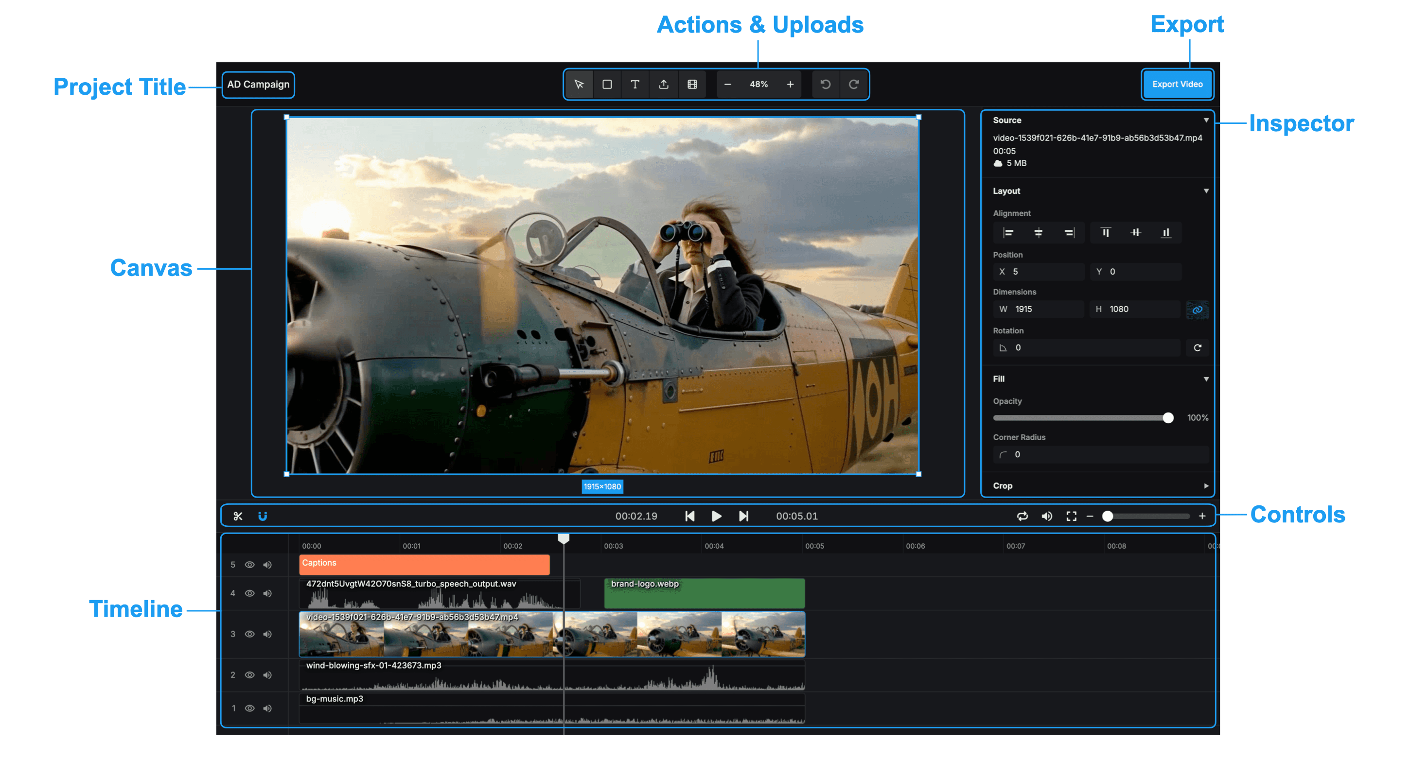
Project Title
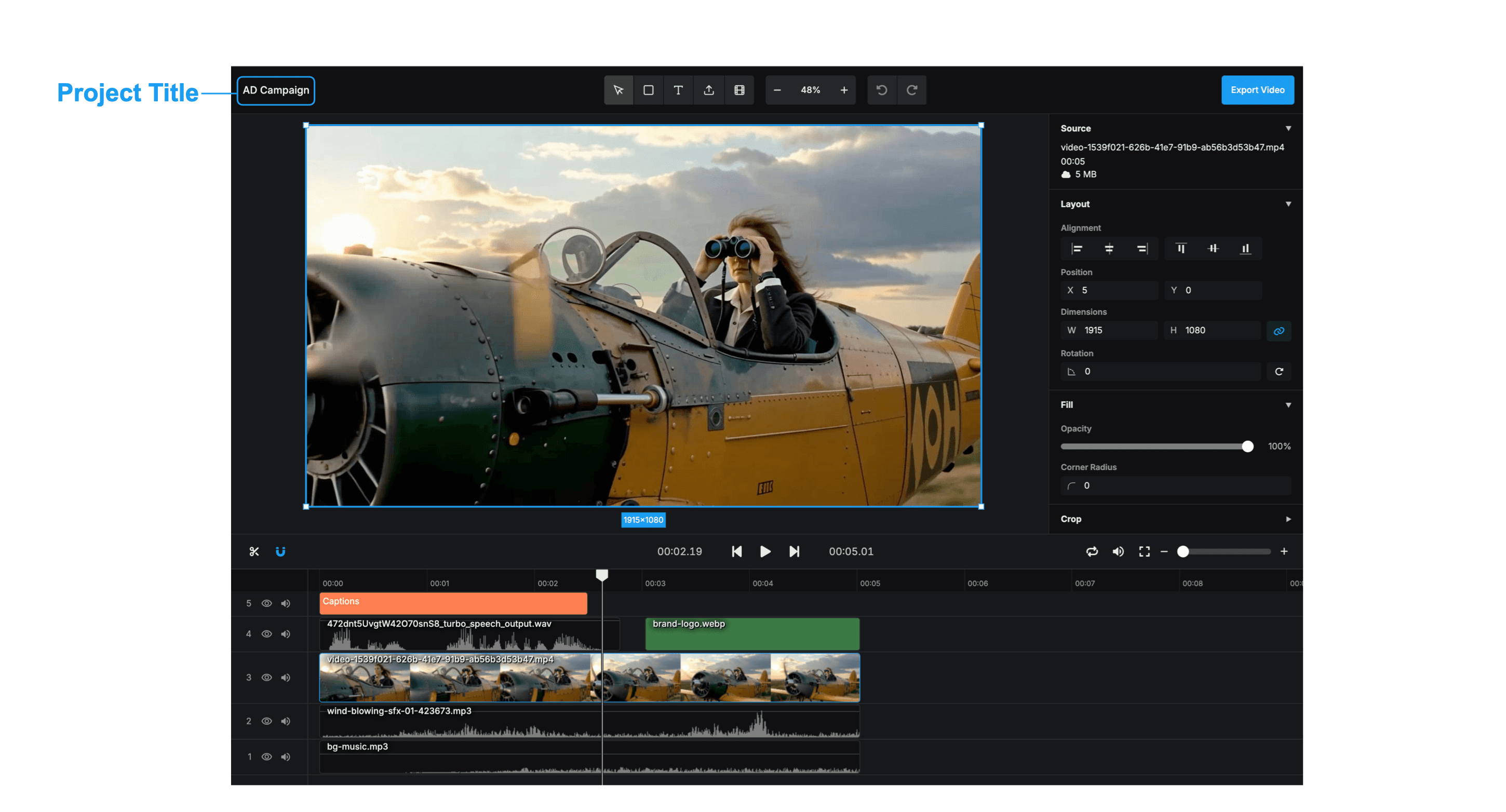
Click on the project title at the top of the editor to rename your project. Keeping your projects clearly named is essential for organization, especially when you are working on multiple videos simultaneously.
Actions & Uploads
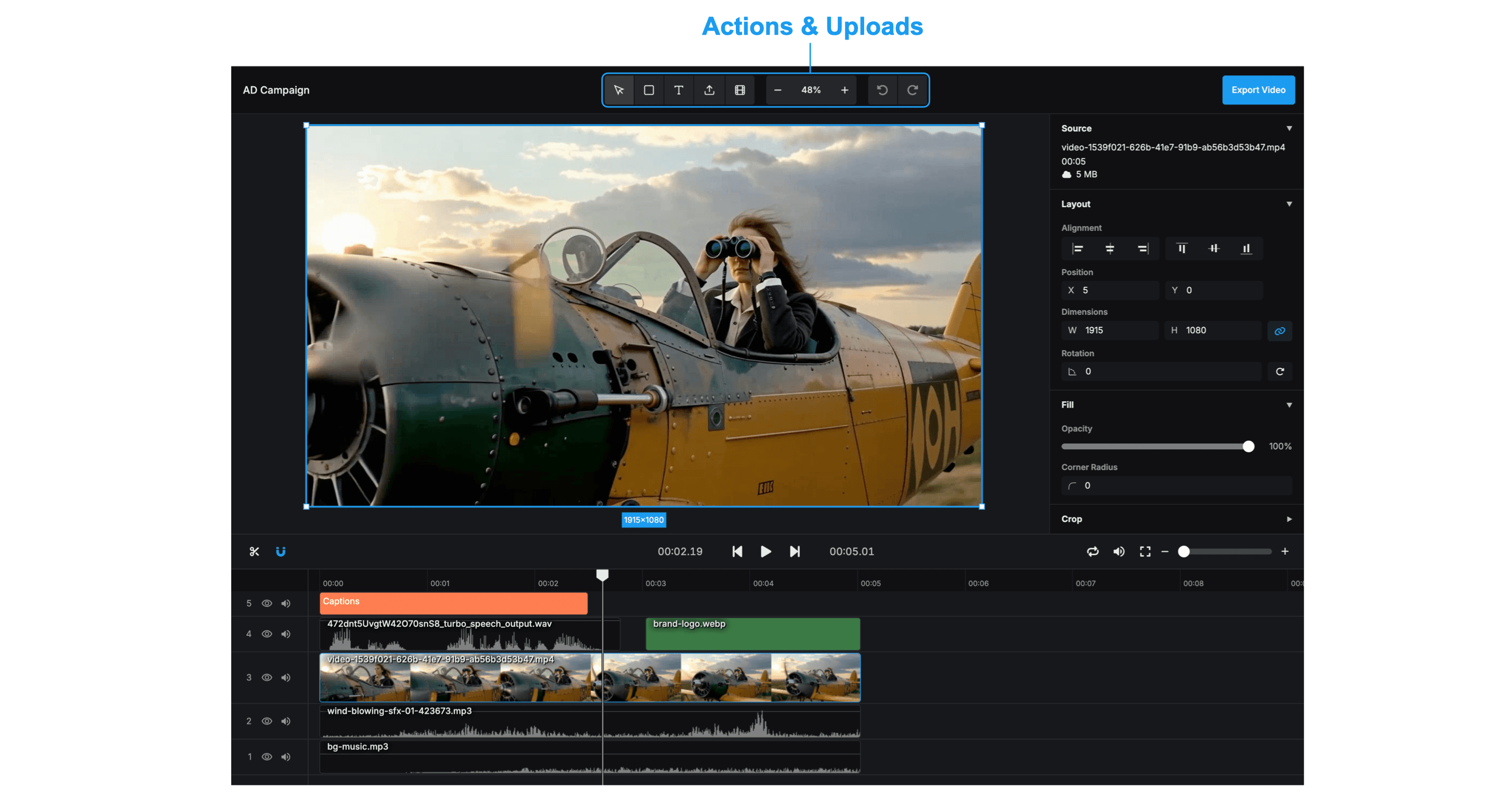
The toolbar provides essential tools for adding content and managing your workspace:
- Select Tool: Use this to select, move, and resize elements on the canvas.
- Add Solid: Insert rectangle solid shapes. These are useful for creating backgrounds, overlays, or text backdrops to improve readability.
- Add Text: Create text layers to add titles, captions, or annotations to your video.
- Upload Media: Upload your own files directly from your computer: Add photos or graphics, video clips, or audio tracks. Assets are uploaded and processed when dropped into the editor. Upload progress is shown with indicators, and assets are stored for use across browser sessions. Multiple file formats are supported.
- Add Generated Assets: Access your library of AI-generated content. Quickly insert images or videos you've created within aicut.
- Zoom Controls: Adjust the canvas view. Click the percentage or "Fit" button to automatically scale the canvas to fit your screen.
- Undo / Redo: Easily correct mistakes or revert changes with these standard editing controls.
Canvas
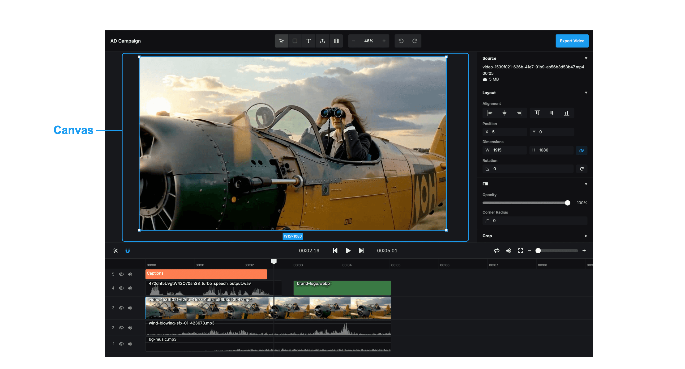
The main preview area where you arrange your visual elements.
- Click to select: Clicking on items in the canvas selects them. Selected items show a blue outline and can be edited via the inspector. Clicking on empty space deselects all items.
- Move and resize: Selected items can be dragged to move their position on the canvas. Resize handles appear on selected items allowing for width and height adjustment by dragging the corners or edges.
- Multiple selection: Multiple items can be selected using Cmd/Ctrl+click (alternatively Shift+click) to add items to the selection, or so called Marquee selection to create a selection rectangle that selects all items within its bounds. Selected items can be moved, deleted, or edited together.
- Drag and drop: Assets can be dropped directly onto the canvas from the file system. The item is automatically positioned to start at the current time and at the position in the canvas where it was dropped.
- Context Menu: Right-clicking on an item shows a menu with options to bring the item to front or send it to back.
- Crop Mode: By double-clicking an item that is croppable on the canvas, Crop Mode is activated, replacing resize handles with crop handles. When in Crop Mode, the full uncropped item is shown in the background with reduced opacity, to help the user visualize the cutout area.
- Paste from Clipboard: When pasting and there is text in the clipboard, the text is pasted as a text item. When pasting and there is an asset in the clipboard, the asset is pasted as a new item (due to browser support, this may only work with images).
Timeline
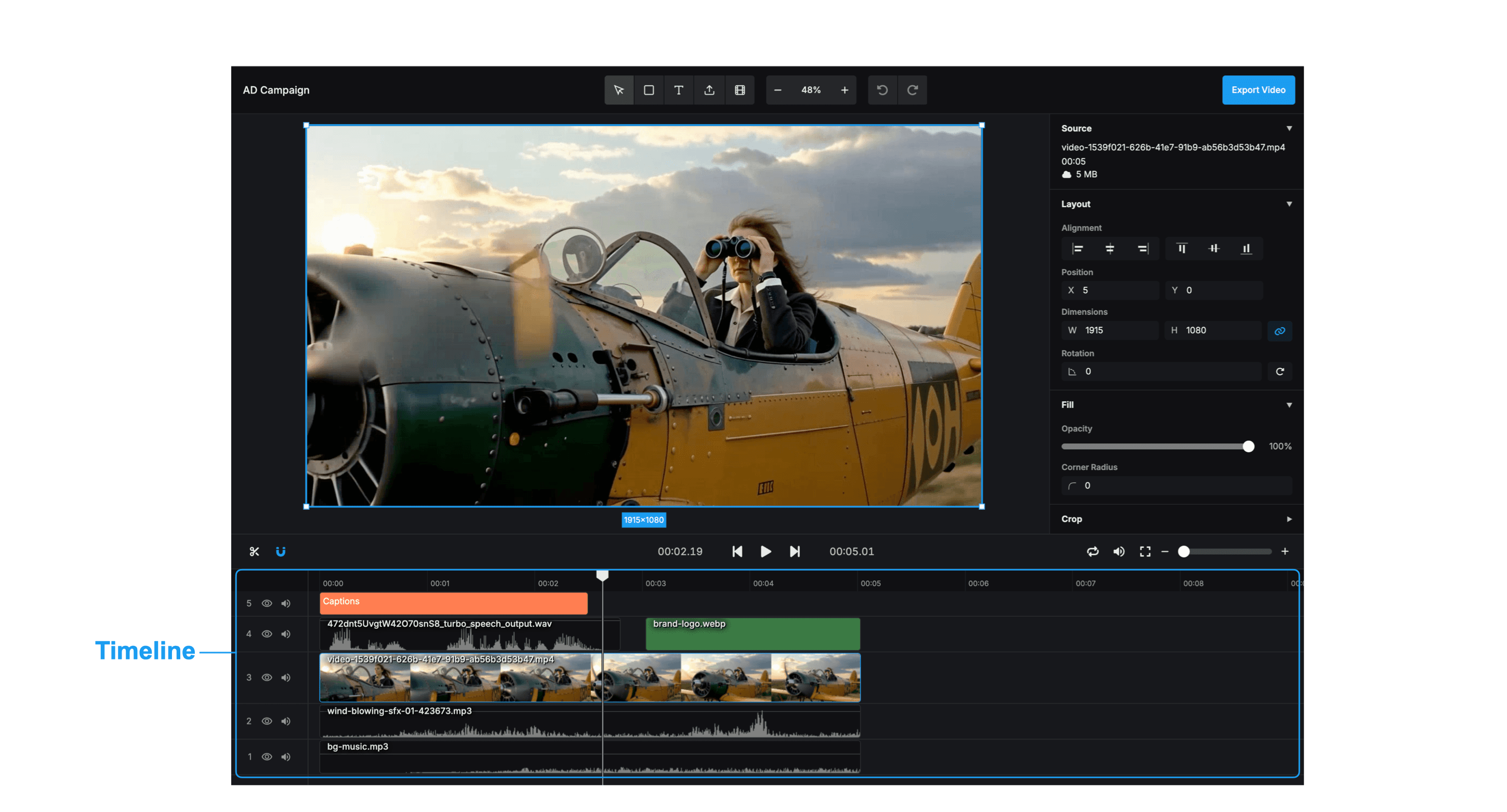
The timeline allows you to see a overview of the content and to scrub through the video. Items are organized in "tracks", allowing multiple items to be placed at the same time and to allow for controlling how they overlap.
- Draggable playhead: Pressing and dragging on the time ticks allows you to move the playhead and therefore the position of the video. If you drag the playhead to the edge of the timeline, the timeline will scroll.
- Import assets: An asset (image, video, audio, GIF) can be dropped on the timeline to import it and add a new layer.
- Drag and drop items: Items can be dragged and repositioned on the timeline. Multi-select is supported, allowing you to drag multiple items at once. A shadow overlay shows where the moving item is being placed when dragging.
- Extend handles: You can drag on either side of an item to extend or shrink the item. When extending an item, the maximum trim position is shown with a white outline of the selected item.
- Volume control: Audio and video items display a draggable volume line on the timeline waveform. Dragging vertically adjusts the volume in decibels with a visual indicator showing the current level.
- Fades: Items support opacity fade in and fade out effects. Audio and video items support fades as well. Draggable handles appear on hover at the start and end of items to adjust fade duration, with visual curves showing the fade effect.
- Split tool: Items can be split at the current playhead position using the scissors tool. The split creates two separate items, properly handling fade effects and media start times for the new segments.
- Multiple selection: Multiple items can be selected using Cmd/Ctrl+click (alternatively Shift+click) to add items to the selection, or so called Marquee selection to create a selection rectangle that selects all items within its bounds. Selected items can be moved, deleted, or edited together.
- Hide track: The eye icon on the left allows hiding a specific track on the timeline.
- Mute track: The volume icon on the left allows muting a specific track on the timeline.
Inspector
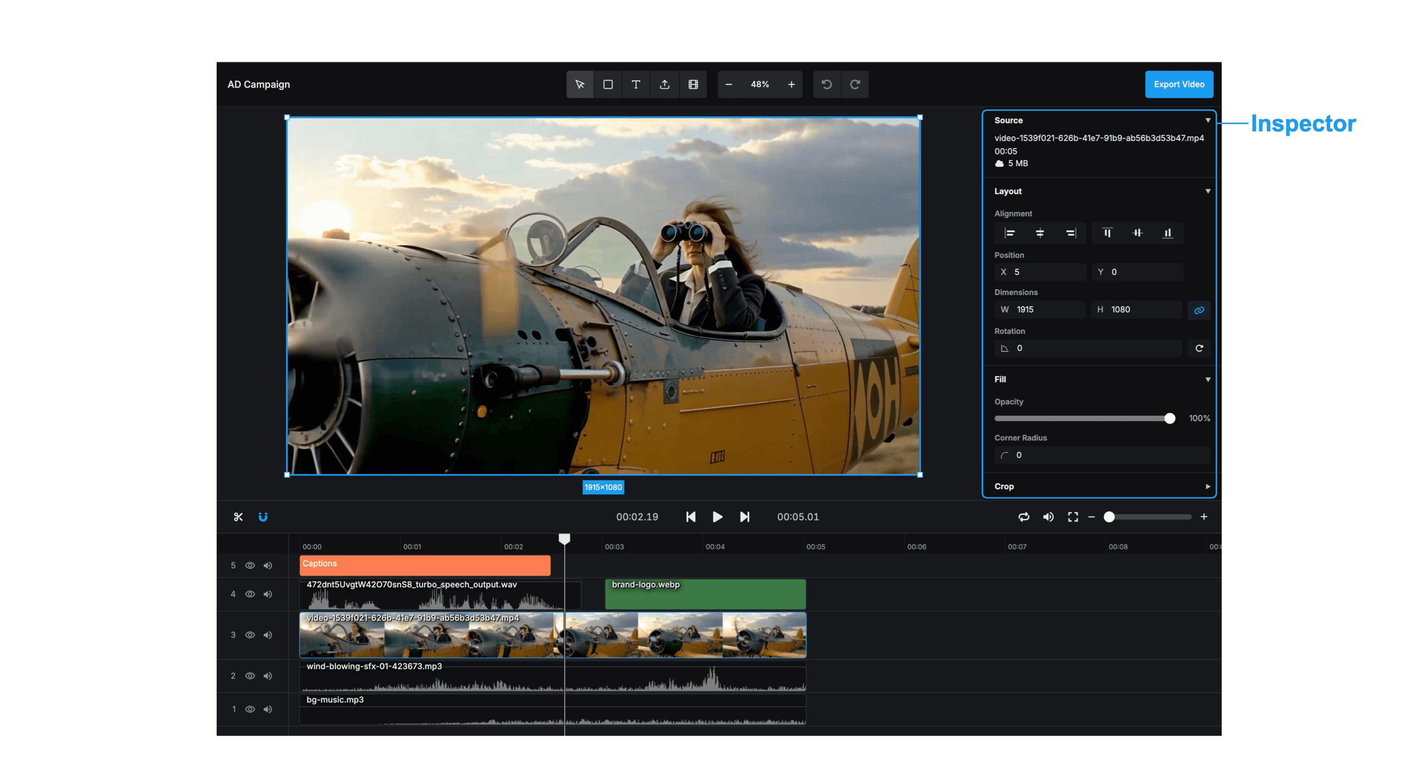
On the right side of the screen, an inspector is displayed which allows for editing the properties of the selected item.
Composition inspector
If no item is selected, controls for the whole composition are displayed:
- Setting the dimensions: Allows setting the width and height of the composition and displays the overall duration.
- Swap dimensions button: Shows a button to swap the width and height of the composition.
Item Inspector
When an item is selected, the inspector shows properties organized into sections. The available sections depend on the type of asset selected.
Source
Available for: All assets
- Source info: Shows information about the associated asset of a selected item, such as the file name, file size, upload progress and download progress of that asset.
Layout
Available for: All visual items
- Layer alignment: Buttons for aligning the item to the left, vertical center, right, top, horizontal center, bottom.
- Position controls: Allows setting the precise X and Y position of the item.
- Dimensions controls: Allows setting the width and height of the item.
- Rotation: Allows changing the rotation of the item.
- Keep Aspect ratio control: Allows setting the keep aspect ratio of the item.
Fill
Available for: Shapes, Text, Captions, Images, Videos
- Color: Provides a color picker for text, solid, and caption items.
- Opacity control: Allows setting the opacity of the item.
Crop
Available for: Images, Videos
- Cropping controls: Allows setting the crop values of the item.
- Border radius control: Allows setting the border radius of the item. In the UI, the border radius is named "Corner Radius".
Video
Available for: Videos, GIFs, Audio
- Playback speed: Allows setting the playback rate for video, audio, and GIF items. Supports rates from 0.25x to 5x with automatic duration adjustment based on the new playback speed.
Audio
Available for: Videos, Audio
- Volume: Provides a volume slider for audio and video items with decibel-based adjustment. Shows the current dB difference to the original audio.
Fade
Available for: Videos, Audio
- Fade in and out: Provides precise controls for fade in and fade out durations for audio and video items. Allows setting fade times in seconds with visual preview of the fade effect.
Typography
Available for: Text, Captions
- Text value: Allows editing the text content via a text area in the inspector. Text area automatically resizes based on content and alignment settings.
- Font family: Allows setting the font family of the item. Includes live preview when hovering over options.
- Font style: Allows setting the font style variant and weight (normal, italic, bold, etc.) for text and caption items. Includes live preview when hovering over options.
- Font size: Allows setting the font size of the item.
- Text alignment: Allows setting the text alignment of the item (left, center, right).
- Line height: Allows setting the line height for text and caption items. Accepts values from 0.5 to 5.0 with automatic text relayout when changed.
- Letter spacing: Allows setting the letter spacing for text and caption items. Supports values from -10px to 50px with automatic text relayout when changed.
- Text direction: Provides left-to-right (LTR) and right-to-left (RTL; like Arabic) text direction controls. Text direction is automatically detected when creating new text items, but can be manually overridden.
Background
Available for: Text, Captions
- Text background: A control allowing to set the background color of a text item.
- Text background horizontal padding: A control allowing to set the horizontal padding of the background of a text item.
- Text background border radius: A control allowing to set the border radius of the background of a text item.
Captions
Available for: Captions
- Caption tokens: A control allowing the correction of the tokens of generated captions.
- Caption page duration: A control allowing to set the duration of one page of captions.
- Lines of caption text: Limits the number of lines of caption text that can be displayed in a text item.
- Caption highlight color: A control allowing to set the color of the currently spoken word in a caption page.
Controls
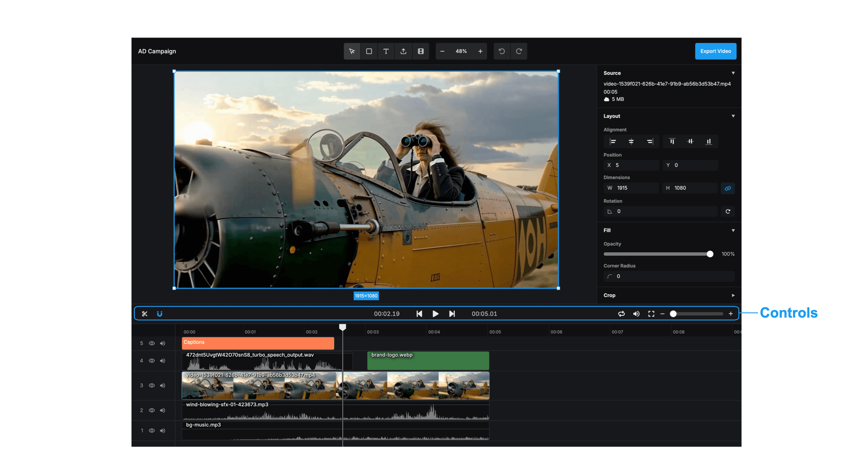
Play, pause, and seek through your video preview.
- Play / Pause: A central play/pause button that starts or stops the video playback. It can also be controlled using the Space bar on the keyboard.
- 00:00Current time indicator: Displays the current playhead position in timecode format (MM:SS.FF, where FF is the frame number).
- Jump to start / end: Buttons to jump to the start or end of the video.
- Fullscreen: Allows entering fullscreen mode for the video player (exiting with Esc).
- Mute: Global mute/unmute switcher for the entire timeline audio.
- Loop: Switcher button to enable or disable looping of the entire timeline.
- Zoom slider: Displays a slider at the right-side, just above the timeline, allowing to zoom in and out of the timeline.
- Timeline Snapping: Enables snapping on the timeline, allowing items to align with other items, the playhead, or grid positions when dragged. This simplifies positioning and transitions. Activate snapping by clicking the magnet icon.
- Splitting items: Items can be split at the current playhead position using the scissors tool. The split creates two separate items, properly handling fade effects and media start times for the new segments.
Export
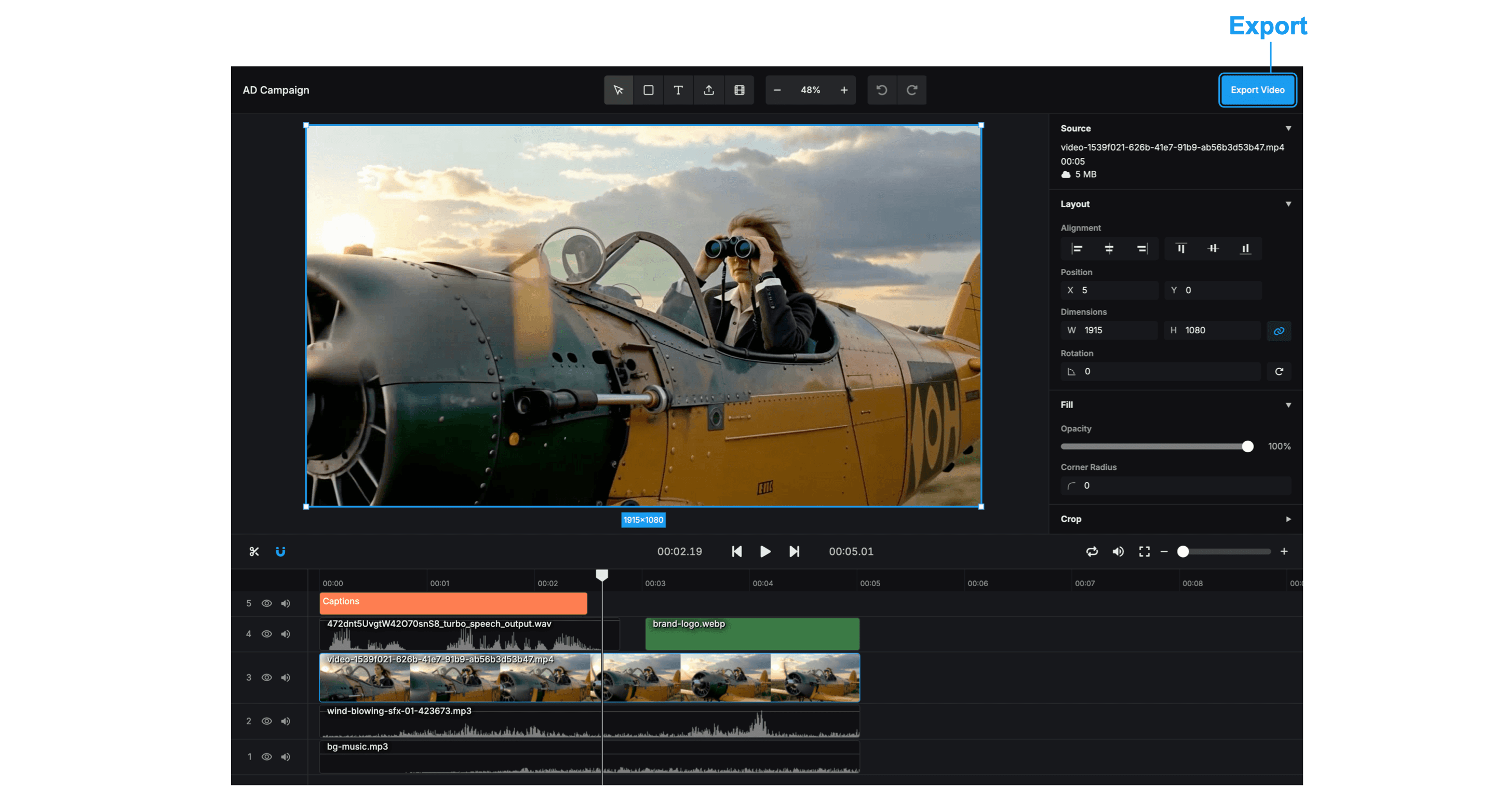
When your video is ready, click the Export button to render the final file. The rendering process will start immediately. Once finished, the video will automatically download to your device.
Keyboard Shortcuts
| Shortcut | Action |
|---|---|
| ⌘/Ctrl + Z | Undo |
| ⌘/Ctrl + Y ⌘/Ctrl + Shift + Z | Redo |
| Right Arrow | 1 frame forward |
| Left Arrow | 1 frame backwards |
| + | Zoom in |
| - | Zoom out |
| 0 | Reset zoom |
| Space | Play / Pause |
| ⌘/Ctrl + S | Save |
| Hold Shift or ⌘/Ctrl | Multi-select items |
| Hold Shift while dragging | Constrain movement to axis |
| ⌘/Ctrl + A | Select all items |
| ⌘/Ctrl + X | Cut selected item(s) |
| ⌘/Ctrl + C | Copy selected item(s) |
| ⌘/Ctrl + V | Paste item(s) |
| ⌘/Ctrl + D | Duplicate selected item(s) |
| Delete / Backspace | Delete selected item(s) |
| Shift + M | Toggle snapping |