
You’ve probably been there. The cut works, the timing is close, but the video still feels cheap because every scene change announces itself. On desktop, the transition looks fine. On a phone, it feels slow, muddy, or overdone.
That’s the gap most after effects transitions tutorials never solve. They show an effect in isolation, usually on a clean demo comp, but not the part that matters in real production: how to structure the project so revisions don’t hurt, how to make transitions hold up in vertical formats, and how to turn a one-off trick into a repeatable workflow.
After Effects has been shaping transition design for a long time. Adobe acquired it in 1994, and the software changed motion design with keyframe animation and mask tools. By 2007, CS3 added 3D layers and expressions, and by 2020, social creators were leaning on techniques like Fast Box Blur on adjustment layers as everyday transition tools in Adobe’s custom transitions guide.
The craft still matters. But if you’re publishing short-form content at volume, craft alone isn’t enough. You need transitions that look professional, preview cleanly, survive revisions, and fit a system.
The Foundation for Flawless Transitions
Most transition problems start before the first keyframe. They start in the timeline.
When creators build an entire short-form video inside one master composition, they usually end up with a stack of footage, text, nulls, adjustment layers, masks, mattes, and effect controls all sitting in one place. It works for a while. Then previews slow down, timeline navigation gets messy, and one text change near the beginning creates cleanup work all the way down the comp.
The better approach is modular composition management. Think LEGO bricks, not one giant sculpture. Each scene is a unit. Each transition is a unit. When you build that way, you can swap, adjust, and reuse pieces without cracking the whole edit open.
Why pre-comps matter
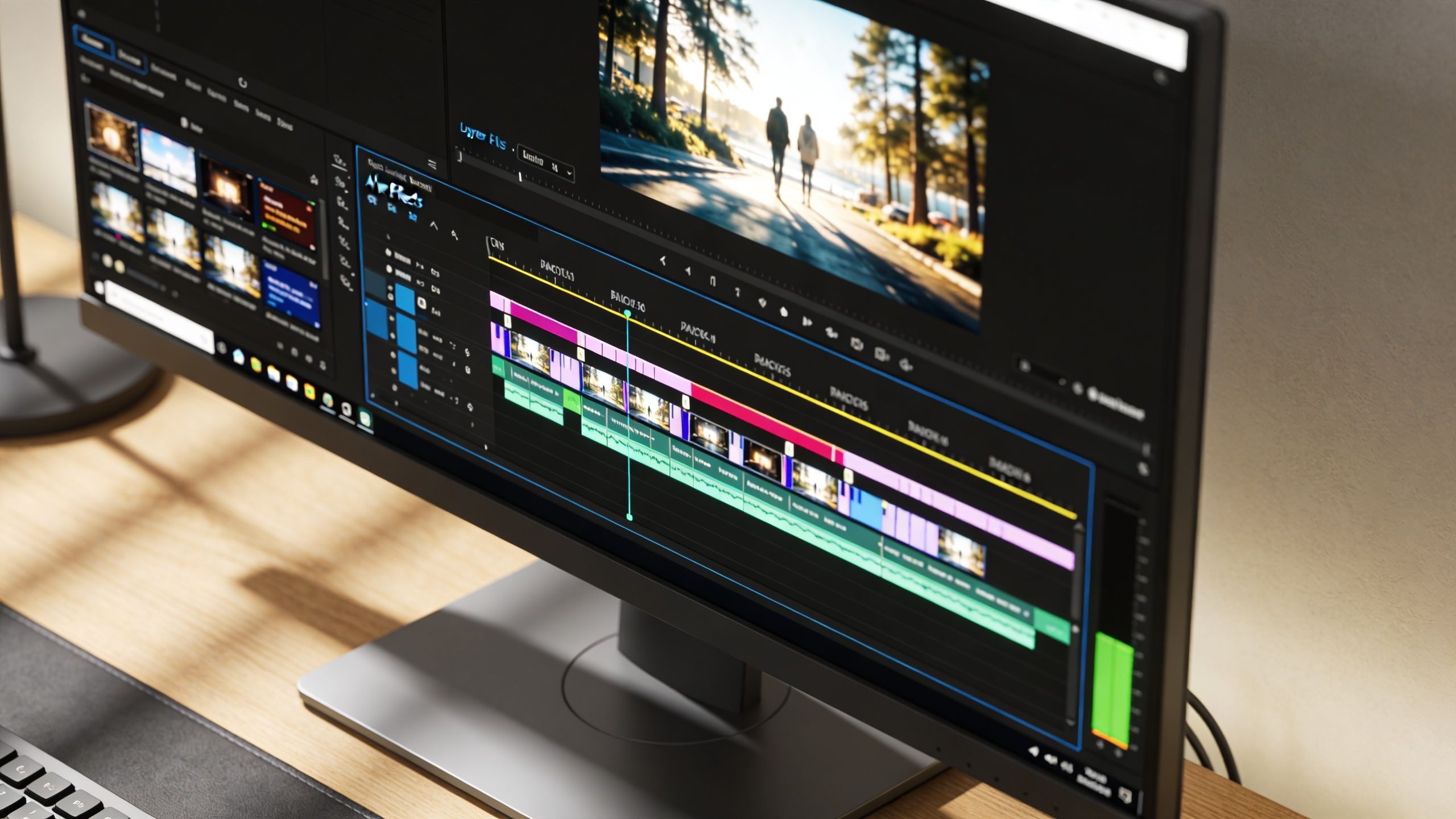
Fluid transition implementation requires structural composition management. Editors who pre-compose segments can disguise cuts within motion, reduce preview rendering time by avoiding unnecessary layer hierarchy traversals, and move faster in short-form workflows, as noted in this practical breakdown of pre-comp-based transition structure.
That matters more in vertical content than people expect. Short videos get revised constantly. A hook changes. A subtitle block shifts up. The client wants a safer crop for Reels. If the transition lives across loose layers scattered through one main comp, every revision becomes surgery.
Practical rule: If a transition touches more than one scene, group the scenes before you stylize the handoff.
A working setup that stays clean
Use a simple hierarchy:
- Scene comps: Each shot or visual beat gets its own composition.
- Transition comps: Build the handoff between scene A and scene B as a separate controlled unit.
- Main assembly comp: Place finished scene units in sequence and reserve this comp for timing, not heavy rebuilding.
When you pre-compose, use Move All Attributes. That keeps animation, masks, effects, and transforms attached to the unit instead of leaving fragments behind in the parent comp. It also makes nested behavior more predictable when you duplicate or retime the section later.
A solid routine looks like this:
- Mark the anchor point where the viewer’s eye is already moving. That’s your easiest place to hide the cut.
- Pre-compose each side of the handoff so you’re dealing with two controlled objects, not a pile of loose layers.
- Trim comp durations so scene timing still matches the master edit.
- Apply transition effects to the pre-comps, not to every underlying layer.
What works and what fails
What works is motion continuity. If the outgoing scene already has movement, use that momentum to bridge into the next shot. What fails is forcing a flashy effect over static shots that have no visual logic connecting them.
Another common mistake is overbuilding early. Don’t polish the transition before the scene timing is locked. Build the structure first, then style it. That one habit saves more time than most shortcut keys.
If your project setup still feels chaotic, a basic cleanup pass helps. This guide to video editing tips for beginners covers some of the habits that make AE timelines easier to maintain once projects start growing.
How to Build 5 Essential After Effects Transitions
Good after effects transitions do one job first. They move the viewer’s attention without making the edit feel clumsy. The effect can be loud or subtle, but the eye path has to stay clear.
These five transitions show up constantly in social edits because they’re flexible. You can build them with native tools, adapt them to different niches, and keep full control over pacing.

Whip pan
A whip pan works when you want energy and direction. The viewer should feel like the camera moved so fast that the cut disappeared inside the blur.
Start with both scene pre-comps in the same timeline. Create a null object and parent each scene to it if you want one shared movement reference, or animate the scene comps directly if the handoff is simple. Push position quickly across the frame over a short span, then enable motion blur.
The secret isn’t speed alone. It’s the shape of the speed curve. Use easy ease, then open the graph editor and make the acceleration aggressive into the middle of the move. That gives the transition a snap instead of a float.
What usually fails is trying to save a static shot with a whip pan. If neither shot contains directional energy, the transition feels pasted on. Add a slight scale move or foreground element drift so the cut has something to ride on.
Zoom transition
A zoom transition is cleaner and more commercial. It pulls the viewer into the next scene instead of throwing them sideways.
Build it by animating scale and sometimes position at the same time. If the outgoing shot zooms in, the incoming shot should continue that visual logic, either by matching the center point or deliberately shifting to a new focal point. A little directional blur or Fast Box Blur on an adjustment layer helps sell the speed.
This style works best when both scenes have a clear subject. Product ads, reaction clips, and explainer edits all benefit from it because the viewer never loses the focal target.
Don’t think of a zoom as magnification. Think of it as a handoff between two frames that share visual weight.
Glitch transition
A glitch transition fits digital, gaming, AI, and tech-heavy content. It should feel sharp, intentional, and slightly unstable.
The easiest native build uses an adjustment layer, color channel separation, and a distortion effect such as Turbulent Displace or a displacement-driven offset. Animate these hard for a brief burst around the cut. Then split RGB channels with duplicated layers, offset them by a few pixels, and time the channel shifts so they hit just before or just after the cut.
Keep it short. If it hangs on screen, it stops reading as a transition and starts reading as damage.
Three details make it work:
- Broken rhythm: Tiny timing offsets in blur, distortion, and channel split feel better than one uniform pulse.
- Contrast spike: A small brightness or exposure jump helps the glitch feel disruptive.
- Clean landing: End on a stable frame quickly, or the viewer won’t trust the next shot.
Here’s a useful visual reference for transition styling in action:
Motion blur blend
This is the transition many editors use without naming it. It’s the polished blur pass that makes a cut feel expensive without drawing attention to itself.
Take the outgoing and incoming pre-comps, overlap them slightly, and animate position, scale, or rotation just enough to create directional continuity. Then use motion blur and a brief opacity crossfade only if the movement alone doesn’t carry the edit.
The trap is overfading. Too much opacity blend creates mud, especially on mobile. Let the motion do most of the work. Use transparency as support, not as the main event.
This style is strong for beauty edits, UGC, interviews with b-roll, and faceless storytelling channels where flashy transitions would compete with captions.
Shape wipe
Shape wipes are simple, but they’re powerful when brand consistency matters. A clean mask-based reveal often outperforms a complicated transition because it looks deliberate.
Create a shape layer or masked solid and animate its path, scale, or position to cover the frame and reveal the next scene. Feather only when the brand style calls for softness. Hard edges often look more modern and cleaner in short-form content.
You can make this feel premium with two additions:
- Use easing so the wipe doesn’t move at a constant rate.
- Add a tiny amount of secondary rotation or scale to the incoming shot so the transition has depth.
A better way to judge your builds
Instead of asking whether the transition looks cool, ask three questions:
| Check | What to look for | Red flag |
|---|---|---|
| Eye path | The viewer knows where to look during the handoff | Attention jumps to an unimportant corner |
| Scene logic | The movement fits the content before and after the cut | The transition feels imported from another edit |
| Recovery | The next shot becomes readable quickly | The effect lingers and delays comprehension |
The strongest after effects transitions aren’t the loudest ones. They’re the ones that keep the edit moving while still matching the tone of the video.
Optimizing Transitions for TikTok and Reels
A transition that feels balanced in a desktop preview can break apart on a phone. Vertical framing changes composition, and mobile playback exposes weak decisions fast. If the transition obscures the subject, smears captions, or creates heavy-looking compression, the edit loses impact.
A real weakness in current tutorial culture is performance advice. Many creators get effect recipes, but almost no guidance on platform-specific rendering constraints for TikTok, Reels, and Shorts, even though quick exports, mobile playback quality, and file size limits matter in daily publishing workflows, as noted in this discussion of short-form transition optimization gaps.
Design for a narrow field of attention
Vertical edits have less room to hide confusion. In a wide frame, the eye can wander and still recover. In 9:16, the subject, text, and transition often fight for the same central zone.
That changes how you should build after effects transitions.
- Keep the focal point stable: If the face, product, or caption block jumps too far, the transition feels harsher than it did in preview.
- Use shorter motion paths: Big lateral travel often reads stronger on a phone than on a desktop monitor.
- Protect readability: If the edit relies on captions, avoid putting the heaviest blur or distortion exactly where text sits.
On mobile, the best transition is usually the one the viewer feels before they consciously notice it.
For creators testing ad creatives across formats, it also helps to understand how platform specs influence the visual result. If you also run paid social, this guide on how to optimize Facebook campaigns in Australia is useful because ad sizing decisions often force the same framing compromises you see in vertical organic content.
If you want examples of transition styles that read well in short-form formats, this collection of cool video transitions is a good comparison point.
Export Presets for Short-Form Vertical Video 2026
Use this as a practical baseline, then test against your footage type.
| Setting | TikTok/Reels | YouTube Shorts | Notes |
|---|---|---|---|
| Container | MP4 | MP4 | Safe default for broad compatibility |
| Codec | H.264 or HEVC | H.264 or HEVC | H.264 is the safer default, HEVC can reduce file size on supported workflows |
| Frame size | 1080x1920 | 1080x1920 | Standard 9:16 vertical delivery |
| Frame rate | Match source | Match source | Avoid forced frame conversion unless necessary |
| Bitrate | Moderate, platform-tested | Moderate, platform-tested | Push only as high as needed for clean gradients and blur-heavy shots |
| Audio | AAC | AAC | Keep audio clean even if dialogue is minimal |
| Render approach | Queue lighter versions for review, final on approval | Queue lighter versions for review, final on approval | Speeds up approvals and prevents unnecessary full exports |
Effects that slow you down
In practice, the heaviest transitions are usually the ones stacking multiple blurs, distortions, high-detail noise, and nested adjustment layers over long durations. They may look dramatic, but they punish preview speed and batch exports.
What works better for scale is restraint. Use one dominant effect, one supporting effect, and strong timing. A clean zoom with blur often outperforms a complicated effect pile because it survives compression and renders more predictably.
The Art of Choosing the Right Transition
Knowing how to build a transition is technical skill. Choosing the right one is editorial judgment.
Most tutorials stop at construction. They show the wipe, blur, or warp, but don’t give you a framework for using it. That gap matters even more for faceless creators and template-driven workflows, where transition choice should follow content type, platform, and monetization goals, as argued in this analysis of transition selection gaps.
Match transition style to content behavior
If the content is fast, competitive, or built around surprise, abrupt transitions usually help. Glitches, whip pans, and impact blurs can support that pace because they reinforce momentum.
If the content is calm, explanatory, or trust-based, softer moves work better. A controlled zoom, shape wipe, or motion blur blend keeps the viewer oriented and makes the edit feel more confident.
Here’s a practical way to approach it:
- If the video sells speed, use hard directional movement.
- If the video sells clarity, use transitions that preserve frame readability.
- If the video sells mood, choose a transition shape that feels native to the visual world.
A simple decision filter
Before applying anything, run the cut through this filter:
| Situation | Better choice | Usually avoid |
|---|---|---|
| High-energy montage | Whip pan, glitch, impact blur | Slow organic wipe |
| UGC or testimonial | Motion blur blend, subtle zoom | Aggressive digital distortion |
| Brand explainer | Shape wipe, clean zoom | Jarring transitions that overpower text |
| Tech or AI aesthetic | Controlled glitch, sharp wipes | Soft sentimental transitions |
A transition should finish the sentence the shot started.
A nature channel can use soft organic reveals because the content already invites smooth visual flow. A tech review can handle hard edges, RGB shifts, and digital disruption because the style supports the subject. A faceless story channel often sits between those extremes. It needs movement, but not so much that subtitles and narrative beats become harder to follow.
The fastest way to make a video feel amateur is to use the same flashy transition everywhere. Variety matters, but logic matters more. Repetition is fine when the transition becomes part of the brand language. Randomness is what breaks trust.
From Manual Craft to Automated Workflows with Aicut
At a certain point, hand-building every transition stops being craftsmanship and starts becoming repetition. The problem isn’t that manual work is bad. The problem is that short-form publishing rewards systems.
After Effects already pushed in that direction. By CC 2018, the Essential Graphics panel standardized template exports, and by 2024, Adobe Stock hosted over 2.5 million templates. In the same source, the templating approach is framed as useful for scaled short-form production, and it notes that for Aicut users this kind of repeatable system can accelerate output and boost TikTok engagement by 25% on average in the cited context of creator workflows from this data-driven animation and templating discussion.
Turn your best transitions into reusable assets
If you’ve built a transition that works, don’t leave it trapped inside one project.
Package the logic. That usually means creating a controlled comp with editable parameters such as text-safe position, blur intensity, color accent, timing offset, or transition direction. Then expose those controls through the Essential Graphics panel so the transition becomes reusable instead of custom every time.
A practical template usually includes:
- Protected timing: So the transition has a fixed rhythm even when content changes.
- Editable controls: Scale, color, blur amount, and direction should be easy to adjust.
- Clear naming: If the template library grows, naming conventions matter more than people think.
- Safe defaults: Start with settings that already work in vertical formats.
What scales well and what doesn’t
Transitions scale well when they depend on broad motion logic. Zooms, wipes, and directional blurs are easy to reuse because they aren’t tied to one exact image.
Transitions scale poorly when they depend on hand-tuned masking around unpredictable footage. A complex custom reveal may look incredible in one hero edit, but if it requires frame-by-frame cleanup every time, it won’t survive a daily publishing schedule.
That’s the shift experienced editors eventually make. They stop asking, “Can I build this?” and start asking, “Can this survive variation?”
Bridge craft with automation
The smartest workflow isn’t manual or automated. It’s both.
Manual AE work gives you taste. You learn pacing, visual weight, and where a cut should disappear. Automation gives you throughput. Once you understand what makes after effects transitions feel polished, you can build a repeatable system around those choices instead of recreating the same decisions from scratch each week.
Workflow insight: Build custom once, package the logic, then reuse the decision.
That’s where broader AI video systems become useful. If you want the operational side of that process, this walkthrough on how to automate AI video creation with Aicut shows how creators turn repeatable video logic into faster publishing workflows.
The important part is mindset. Don’t treat transitions as isolated effects. Treat them as components inside a production pipeline. Once you do that, your best edits stop being one-time wins and start becoming repeatable assets.
If you want to turn strong transition design into a faster publishing system, Aicut helps short-form creators generate and automate faceless videos for YouTube, TikTok, and Instagram with viral-ready templates, prompt cloning, built-in editing tools, voiceovers, scheduling, and one-click posting. It’s a practical next step when you’re ready to move from handcrafted experiments to a workflow that can publish at scale.