
You post a short video. Views climb fast. Comments look healthy. A few people ask where to buy. Then you check your site and almost nothing happened.
That gap frustrates almost every creator and growth marketer at some point. The mistake is treating short-form video and the landing page as two separate jobs. They aren't. They are one conversion path. The video creates intent. The landing page either carries that momentum forward or kills it.
Conversion rate improvement gets easier when you stop thinking about it as a bag of random tweaks. It's leak repair. A person sees a clip, feels curiosity, taps, lands, scans, hesitates, then either acts or leaves. If you can spot where that handoff breaks, you can fix it without guessing.
Creators often overinvest in the top of funnel because views are visible and exciting. Sales friction is quieter. A weak hook hurts clicks. A mismatched page hurts trust. A cluttered checkout hurts completion. All three can be true at once, but usually one is doing most of the damage.
The fastest path is to diagnose the journey from feed to conversion, tighten the message match, remove friction, and only then start testing refinements. That's how short-form stops being vanity distribution and starts acting like a revenue channel.
Why Your Views Aren't Turning into Sales
A lot of creators are sitting on the same pattern. One Reel pops. A TikTok gets shared. Shorts bring attention. But the product page, lead form, or checkout stays flat.
That usually doesn't mean your audience is bad. It means the journey after the view isn't built to convert.
The real problem is broken continuity
Short-form content works because it compresses attention. A viewer decides in seconds whether your idea matters. If they click, they expect the next page to continue the exact same story.
Most pages don't do that.
The video promises one thing. The landing page opens with a different headline, a generic hero image, too many links, and a CTA that asks for too much too soon. The visitor feels friction before they feel clarity, so they leave.
Practical rule: If your landing page doesn't look like the natural next frame of the video, expect drop-off.
This is why conversion rate improvement shouldn't start with button colors or headline brainstorming. It starts with message continuity. The promise in the video, the click reason, and the page CTA need to line up.
Views are not the goal. Qualified motion is
High views can still be useful. They tell you the content package has pull. But views by themselves don't prove buying intent.
Use this lens instead:
- Attention quality: Did the video attract the right person, or just broad curiosity?
- Click motivation: Did the viewer know why they should tap?
- Page readiness: Did the page immediately validate the reason for clicking?
- Action simplicity: Was the next step obvious and low friction?
When one of these breaks, creators often respond by posting more. More volume can help reach, but it won't fix a broken funnel.
Think in one system
The video is not separate from the page. It pre-sells the click. The page finishes the sale.
A creator with a strong hook and weak page will waste traffic. A creator with a polished page and weak creative will never send enough qualified visitors into the funnel. The win comes from tightening both sides together, then improving the handoff between them.
Diagnose Your Funnel Leaks from Video to Landing Page
Before changing copy, layout, or checkout steps, identify where people are dropping. Most conversion problems look the same from a distance. Traffic came in and sales didn't. Up close, the leak is usually in one of five places.
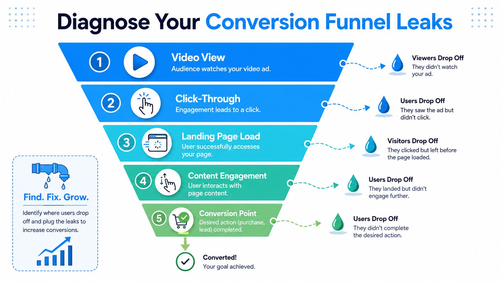
Break the path into stages
Use a simple funnel review:
- Video view
- Click-through
- Landing page load
- Content engagement
- Conversion point
If you collapse all of that into one dashboard number, you'll miss the core issue.
What each stage is telling you
Here's a practical way to read the funnel.
| Stage | What to watch | What a leak usually means |
|---|---|---|
| Video view | Hold quality, comments, saves, drop-off pattern | The hook is weak or the framing attracts the wrong viewer |
| Click-through | Tap intent from the creative | The CTA is vague, the offer is unclear, or the audience is curious but not ready |
| Landing page load | Bounce behavior right after click | Slow load, mismatch, or trust problem |
| Content engagement | Scroll depth, attention on page sections | Users don't see relevance fast enough |
| Conversion point | Add to cart, form starts, checkout completion | Friction in the form, cart, or checkout |
If your video gets attention but almost nobody clicks, don't touch the landing page first. If people click and leave instantly, the page handoff is broken. If they engage but stop at checkout, your offer may be fine and your process is the issue.
Use benchmarks carefully
For context, the 2026 median website conversion rate is 2.35%, while top-decile performers reach 11.45%, according to Digital Applied's conversion benchmarks. For ecommerce, a good rate is 2% to 4%, and below 1% signals major friction in the journey, based on the same benchmark source.
Those numbers are useful, but they shouldn't distract you from diagnosis. A creator with a low click rate and a decent page needs a different fix than a store with solid traffic and a checkout leak.
Don't benchmark yourself into complacency. A page converting at "average" can still be losing a lot of revenue if the post-click experience is messy.
A simple decision tree
Use this when you're stuck:
- Strong views, weak clicks: Rewrite the value proposition in the video itself.
- Strong clicks, high bounce: Match the landing page headline to the exact claim in the video.
- Good engagement, weak completion: Simplify the form or checkout path.
- Mixed signals everywhere: Fix the largest mismatch first, not the smallest design detail.
If you need help tightening the click stage specifically, this guide to click-through rate optimization is a useful companion.
Don't diagnose from one metric alone
A high bounce rate can mean poor message match. It can also mean the page loaded slowly, looked untrustworthy, or was hard to use on mobile. Treat metrics as clues, not verdicts.
The goal of conversion rate improvement is not to chase one dashboard number. It's to find the stage where user intent dies, then remove the reason.
Crafting High-Converting Video Creative with Aicut
Short-form video has one job in the funnel. It should earn a qualified click. Not just attention. Not just shares. A click from someone who understands the offer and wants the next step.
That changes how you make the creative.
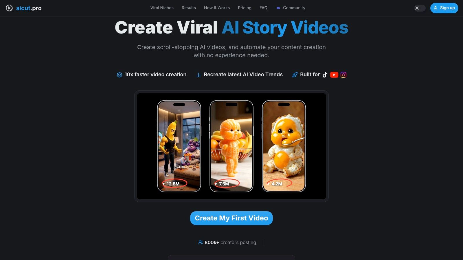
Start with the first three seconds
Most creators bury the reason to care. They start with scene setting, branding, or an overlong intro. For conversion-focused content, the opening needs to do one of these immediately:
- Call out a problem: Name the friction the viewer already feels.
- Show a before-and-after contrast: Let the payoff appear before the explanation.
- Make the offer concrete: Tell the viewer what they're about to get.
The hook isn't just about stopping the scroll. It qualifies the viewer. A broad hook can create views and weak buying intent. A sharper hook usually brings fewer, better clicks.
Build the CTA into the story
The most common weak CTA in short-form is “link in bio” thrown at the end. That often feels disconnected from the content that came before it.
A stronger approach is to make the click feel like the natural continuation of the video. This is where personalization matters. WordStream's conversion benchmark roundup notes that personalized CTAs perform approximately 202% better than generic versions, and that email marketing converts at 15.22% on average. The lesson is clear. Relevance beats generic prompting.
So instead of saying:
- “Check it out”
- “Learn more”
- “Link in bio”
Try CTAs that finish the thought:
- “Tap through to see the exact setup”
- “Get the full product breakdown”
- “Use the page to find the version that fits your goal”
A CTA works best when it answers the viewer's next question.
Thumbnails and visual packaging still matter
Even on autoplay-heavy platforms, the thumbnail and opening frame shape expectation. If the image promises drama and the page sells a calm educational product, the funnel starts with a lie.
This is where production choices matter. If you want a good practical refresher on video quality for creators, that guide covers the basics that influence watchability without overcomplicating the process.
Use templates to speed up testing
Faceless creators usually lose time in production, not in idea generation. Templates solve that by letting you test message angles quickly without rebuilding each video from scratch.
Useful formats include:
- Narrative templates: Good for story-led products and problem-solution hooks
- Motion-led formats: Strong for visual reveals and product demos
- UGC-style sequences: Better when trust and realism matter more than polish
What matters is not the template itself. It's whether the format supports a clear click reason.
A more detailed walkthrough on structuring ads around action is in this guide on how to create AI video ads that convert.
Here's a useful video example to study for pacing and framing:
What works better than endless ideation
When a niche is moving fast, don't rely on pure creativity. Reverse-engineer patterns that are already winning attention, then adapt them to your offer. The key is not copying surface style. It's identifying what made the message easy to understand and easy to act on.
The best short-form creators treat creative like packaging for intent. They don't ask, “Will this go viral?” They ask, “Will the right viewer know exactly why to click?”
Designing the Landing Page That Seals the Deal
A strong video can only create momentum. The landing page has to cash it in.
When creators complain that paid traffic, organic short-form, and influencer clips “don't convert,” the page is often where trust breaks. The click arrived warm. The page turned that warmth cold.
Message match is the first requirement
The first screen should confirm the promise that earned the click. Same problem. Same outcome. Same audience. If the video said “fix your checkout friction,” the page can't open with vague brand positioning.
Visitors don't reward creativity here. They reward clarity.
A quick test works well. Ask: if someone saw only the video and the first screen of the page, would they say both came from the same campaign? If not, rewrite the hero.
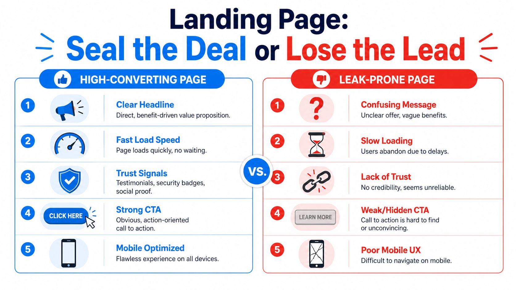
Friction beats persuasion more often than you think
Most low-converting pages don't fail because they lack copy. They fail because they make action harder than it needs to be.
Matomo's CRO best-practices article notes that showing progress indicators in a multi-step checkout can reduce abandonment by 20% to 30%, and hiding coupon fields can prevent an 18% drop in conversions from users leaving to search for codes.
Those are not cosmetic changes. They remove uncertainty and distraction.
What to simplify first
Focus on these friction points:
- The first screen: Make the offer obvious before the visitor scrolls.
- Navigation: Remove exits that compete with the primary action.
- Forms: Ask only for what you need now.
- Checkout flow: Keep the sequence short and predictable.
- Coupon handling: Hide promo-code entry behind a link unless discounts are central to the offer.
The fastest way to lift conversions is often subtractive. Fewer fields, fewer links, fewer decisions.
Trust has to appear early
Short-form traffic can be skeptical because the jump from social feed to transaction page feels abrupt. Trust signals reduce that shock.
Use:
- Customer testimonials near the point where doubt appears
- Payment provider logos near checkout
- Security and SSL indicators where someone is about to submit information
- Clear product or offer details so nobody feels tricked into the click
Don't dump trust badges in the footer and assume the job is done. Put reassurance where hesitation happens.
Mobile decides more than desktop design reviews do
A lot of pages still get approved on desktop and fail on phones. That's backwards for short-form traffic. Someone who taps from TikTok or Instagram expects a page that feels native to mobile behavior. Large tap targets, obvious hierarchy, short sections, and fast clarity matter more than polished desktop aesthetics.
Here's a practical review format:
| Page element | Keep it if | Remove or change it if |
|---|---|---|
| Headline | It repeats the click promise clearly | It sounds like generic brand copy |
| Hero image or video | It supports the offer instantly | It delays understanding |
| Form fields | Each one is necessary now | You're collecting future-use data too early |
| Navigation links | They support buying confidence | They create escape routes |
| CTA button | It states the next step plainly | It uses vague wording |
The best landing pages don't feel persuasive. They feel easy.
Practical Testing and Analytics for Growing Channels
A lot of CRO advice breaks down for creators because it assumes high traffic. It tells you to split-test every button, headline, and image variation until the data speaks. But if your page gets limited visits, that workflow can waste months.
That's the low-traffic CRO problem. You still need conversion rate improvement, but you can't rely on endless formal experiments.
Stop pretending small samples are proof
For low-traffic sites, the smarter move is often observation first, testing second.
Sitetuners' guide on increasing conversion rate highlights the issue directly. Seventy percent of carts are abandoned due to friction, and for smaller channels that can't reach statistical significance, the focus should shift toward heuristic analysis and qualitative insights such as heatmaps and session recordings. The same source also notes that personalized CTAs convert 202% better than generic ones, which makes relevance a higher-priority lever than micro-design tweaks.
If you only get a modest flow of visitors, don't spend your best energy on tiny tests that need large samples.
What to look at instead
When traffic is light, review behavior manually.
- Session recordings: Watch where users hesitate, backtrack, or rage-click
- Heatmaps: Check whether attention reaches your CTA or dies early
- Form analytics: Find the exact field where people stop
- Channel pattern checks: Compare visitors from different short-form platforms to see who bounces faster
This kind of analysis won't give you false certainty. It gives you clues you can act on.
Make bigger bets, not smaller ones
Low-traffic creators should favor high-contrast changes. Don't test a slightly different button shade. Test a stronger offer framing, a cleaner page layout, or a different CTA promise.
Good examples of big-swing changes:
- Switching from a general hero headline to a problem-specific one
- Moving testimonials above the fold
- Turning a long form into a shorter first-step capture
- Rewriting the CTA to reflect the promise made in the video
For smaller channels, the highest-value insight is usually not “version B won.” It's “users are confused right here.”
Track the right metrics together
Creators also make analytics harder than they need to be by checking platform metrics in isolation. Video views live in one tool. site behavior lives in another. Paid metrics sit somewhere else. That leads to local optimization instead of funnel optimization.
A better discipline is to review channel performance, click behavior, and on-page completion in one rhythm each week. If you want a clean primer on how to understand your SEO reporting KPIs, that helps sharpen the broader habit of tracking performance by business outcome instead of vanity numbers.
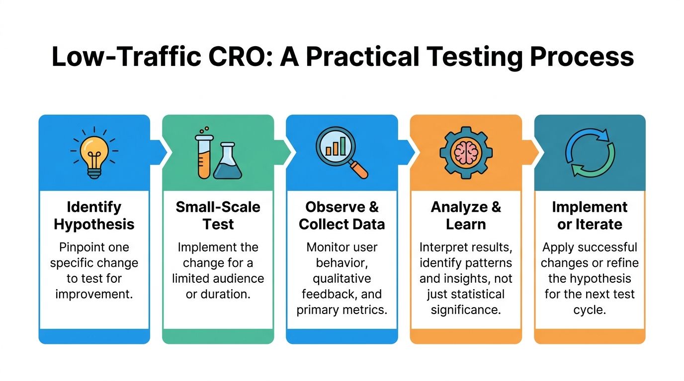
Use a practical loop
Keep the process tight:
- Watch user behavior.
- Write one clear hypothesis.
- Make one meaningful change.
- Review results with context.
- Keep, revise, or undo.
That loop is less glamorous than “always be testing,” but for growing channels it's more honest and more useful.
Automate and Retarget for Consistent Conversions
The biggest shift happens when conversion rate improvement stops being a rescue job and becomes a system. That's where automation and retargeting matter.
Short-form viewers rarely convert on first contact. Some are interested but distracted. Some need another proof point. Some clicked, got close, and left because the moment wasn't right. If you don't follow up, you keep paying to reacquire attention you already earned.
Retarget warm intent, not just cold audiences
Treat video viewers, page visitors, and cart abandoners as different pools.
A practical structure looks like this:
- Video viewers: Show a second asset that deepens the claim or answers a common objection
- Landing page visitors: Retarget with tighter proof and a more direct CTA
- Cart or form abandoners: Remove friction, clarify the next step, and reduce uncertainty
This works best when the follow-up creative acknowledges where the person stalled. Someone who watched but never clicked needs a better reason to visit. Someone who reached checkout needs reassurance and simplicity, not another top-of-funnel explainer.
Automation gives you enough surface area to learn
Consistent posting matters because it creates more opportunities to find the message-market fit that converts. But consistency is hard when every video requires manual scripting, asset sourcing, editing, and scheduling.
That's why automation has real strategic value. It doesn't just save time. It lets you test more angles without losing operational focus. Fresh creative also improves retargeting because your warm audiences don't see the same stale asset repeatedly.
For creators trying to build a repeatable publishing system, this guide on how to automate social media posts is worth reviewing.
Use testing discipline where it counts
At larger traffic levels, formal testing becomes more useful again. Quantum Metric's guidance on improving conversion rates notes that a structured A/B testing cycle should be built from data-led hypotheses and reach 95% statistical significance. Without that threshold, up to 40% of optimization initiatives can show false positives. The same source says consistent adherence can yield 10% to 25% conversion lifts over time.
That matters because automation can flood your funnel with activity, but activity alone doesn't equal learning. Once traffic is there, tighten your test discipline.
Build the loop, then let it compound
A strong system looks like this:
| Layer | What it does |
|---|---|
| Short-form creative | Generates qualified attention |
| Landing page | Converts momentum into action |
| Retargeting | Recovers intent that didn't convert the first time |
| Automation | Maintains publishing and testing consistency |
| Structured testing | Turns repeated activity into reliable learning |
Creators who grow fastest usually aren't doing one magical thing better. They're running a cleaner loop. Better message in the video. Better handoff on the page. Better follow-up after the click. Better consistency in production.
That's how a channel stops feeling random and starts producing predictable outcomes.
If you want to put this playbook into motion without building every creative asset by hand, Aicut helps you create faceless short-form videos, adapt winning styles with prompt cloning, schedule posts, and keep campaigns running consistently across YouTube, TikTok, and Instagram. It's a practical way to tighten the link between video production and conversion-focused growth.