
You've got the photo. Maybe it's a birthday shot, a group image, or a campaign mockup, and one person needs to be added cleanly so the scene feels real. The hard part isn't dragging a cutout into place, it's making the final composite survive a close look.
That's what separates a believable edit from something that reads as pasted on. The same rules that governed early composite photography still apply, because the eye has always looked for the same tells, eye line, scale, shadow, and texture. One of the earliest documented composites placed Abraham Lincoln's head onto John C. Calhoun's body, and another early example, from 1846, retouched a monk out of a rooftop photograph in Malta with India ink (historical overview of composite photography). The tools changed, but the visual logic didn't.
Picking the Right Source Photos
Composite work started long before software, which is why source selection still matters more than the tool. If the two photos fight each other from the start, no amount of masking or AI cleanup will make the result feel natural. The earliest composites were manual, but they still depended on the same things that matter now, like viewpoint, scale, and lighting consistency (historical overview of composite photography).
Start With the Scene, Not the Person
The easiest mistake is choosing a great portrait and forcing it into the wrong background. A subject shot from slightly above will look wrong in a scene photographed at eye level, and the mismatch shows up fast in the shoulders, head angle, and how the body sits in space. If the scene is outdoors, check whether the light is hard or soft, warm or cool, because that decides whether the person belongs there.
A good pairing usually shares more than one trait. Match the camera height first, then look at lens feel, shadow hardness, and how much detail the background carries. A close, shallow-focus portrait rarely drops cleanly into a wide, busy scene without extra work, because the visual language is too different.
Practical rule: If you can't describe the light source in both photos, they probably don't belong together yet.
Avoid the Usual Beginner Trap
Beginners often start with whatever photo they already have, then try to fix the mismatch later. That leads to weird proportions, off-angle heads, and obvious edge work. The smarter move is to plan around the source material you already own, then choose the scene that gives you the fewest problems.
Resolution matters too, but not in the abstract “higher is better” way people repeat online. What matters is whether the inserted person can hold up next to the background detail without turning fuzzy, crunchy, or oversized. If the background is soft and distant, a slightly lower-detail subject can still blend. If the scene is sharp and close, the cutout has to survive scrutiny.
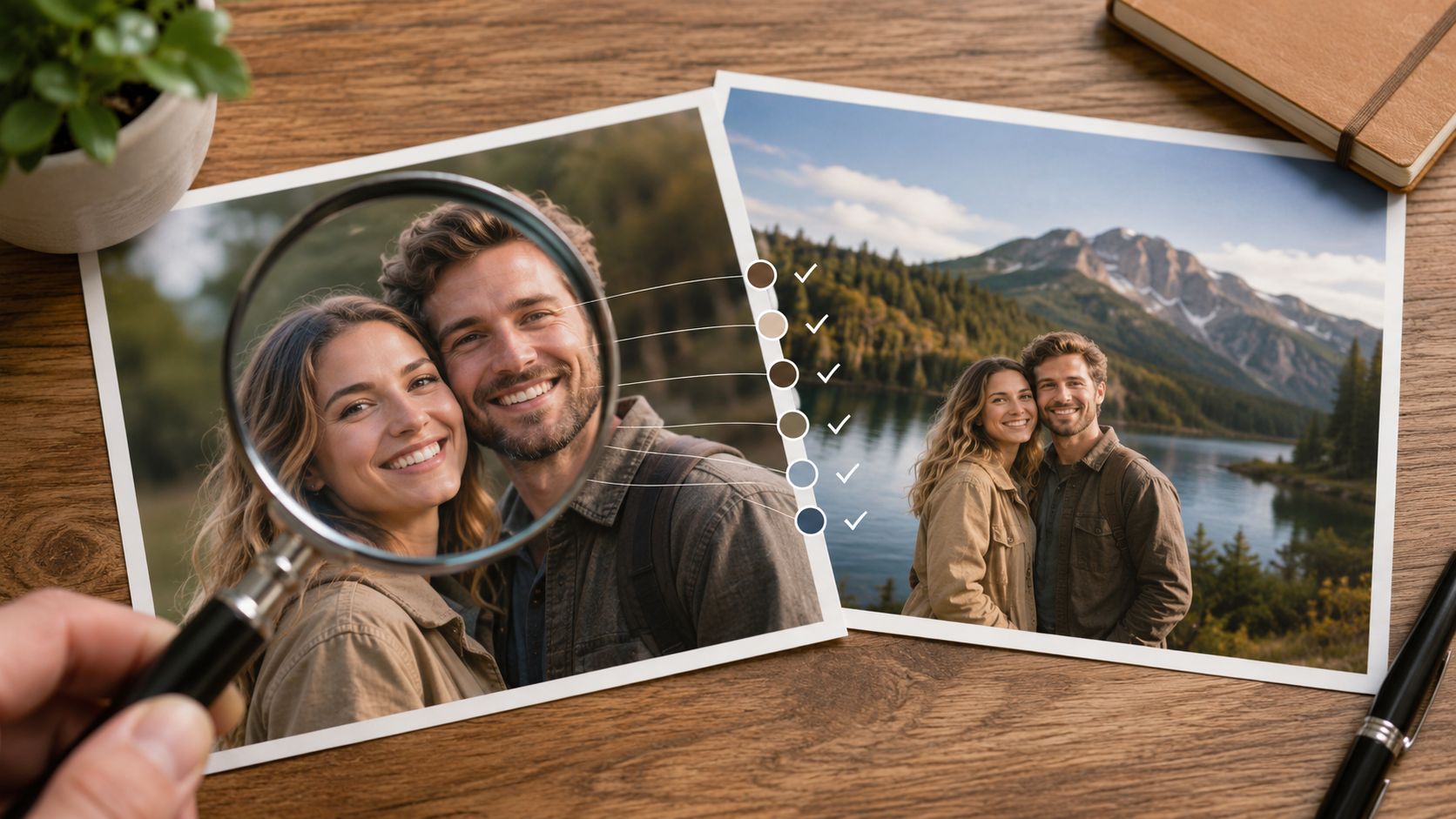
A Quick Selection Check
Before you edit, compare both photos against the same questions.
- Camera height: Do both images feel like they were shot from the same general eye level?
- Light direction: Can you tell where the main light comes from in each frame?
- Shadow style: Are the shadows crisp, soft, or barely there?
- Color mood: Is one image warm and golden while the other is cool and flat?
- Detail level: Will the inserted person need more texture to survive the background?
When those answers line up, the edit gets much easier. If they don't, it's usually faster to find a better background than to fight a bad match all the way to the end.
Extracting the Person Cleanly
A rough cutout is where a lot of composites die. A sharp outline can still look wrong if the hair is chopped off, the shoulders have haloing, or the edge carries a weird strip of the original background. Good extraction is less about removing the background and more about preserving the subject's real contour.
Choose the Right Extraction Method
Different edges need different tools. A clean profile against a plain wall is a good job for a Pen Tool or a straightforward subject selection. Fine hair, fabric fray, and translucent details need refinement, often with edge brushes or matte cleanup. Busy crowd photos are the hardest, because you're separating one person from similar tones and overlapping bodies.
Automatic tools are useful when speed matters, especially for first passes. Photoshop's Select Subject can get you close fast, and AI removers can save time on routine cutouts. But the automatic result still needs human judgment, because the tool can't know which stray pixel is important and which one should disappear.
Use the edge type as your guide.
- Clean architectural edges: Use the Pen Tool or precise masking.
- Hair and soft fabric: Use refine-edge brushing and matte cleanup.
- Crowded scenes: Start with AI, then manually repair overlaps.
- Semi-transparent detail: Inspect the mask on a checkerboard and correct the weak spots.
If you want a practical comparison of automated face and subject workflows, the process in Aicut's face-change guide shows how much of the work still comes down to careful masking after the first pass.
A fast mask is a starting point, not a finish line.
Work the Edge at a High Zoom
At close zoom, look for three problems: chopped hair, leftover background color, and holes in semi-transparent areas like veils or loose fabric. Hair should taper naturally, not end in a hard line. When you see a green or blue fringe, that usually means the original background color is bleeding into the edge and needs cleanup.
Use a soft brush only where the edge is supposed to be soft. Don't blur the whole mask just to hide mistakes. That usually makes the subject look cut out in a different way, because the outline becomes mushy while the rest of the image stays sharp.
Test the Cutout on a Neutral Background
Drop the subject onto gray or checkerboard first. That makes edge errors easier to see than testing directly on the final background. If the subject already looks clean there, you've earned the right to move on.
The best cutouts disappear into the workflow. You notice them only when they're bad.
Matching Perspective Scale and Lighting
A composite breaks fast when the person does not belong to the scene's space. The body may be cut out cleanly, but if the eye level is wrong, the scale is off, or the lighting fights the background, the edit still reads as pasted in. Those are separate problems, and each one needs its own correction.
Fix the Perspective Before Anything Else
Perspective starts with eye level and depth. If the background's vanishing lines meet higher or lower than the subject's shoulders and eyes imply, the cutout feels detached from the environment. A person can match the scene's color and still look wrong if the spatial setup is off.
Look for the strongest linear cues in the frame, like roads, walls, tables, or floor tiles. Those lines show where the viewer is standing. Place the subject so the head height, body angle, and feet all make sense in that same spatial system.
Scale the Person Against Real Objects
Size mistakes are easy to miss on a clean cutout. They show up once the person is next to a chair, door frame, railing, or another person in the background. If the subject is too large or too small beside those references, the edit falls apart right away.
Scale is not just height. It also includes depth. A person placed farther back should usually look smaller and less dominant in the frame, even if the original portrait was shot close and looked strong on its own. That is why matching the subject to the scene's depth cues matters more than guessing by eye.
Match the Light Source and Color Temperature
Lighting is the final realism check. Find the brightest area in the background, then work out where the subject's light should come from if they were really standing there. Shadows need to fall away from that source, not across the body in a direction that ignores the scene.
Color temperature is where a lot of composites drift into fake territory. A cool background with soft daylight can make a warm, orange subject look pasted on, while a golden-hour scene can make a neutral portrait feel flat. Adjust the subject's warmth or coolness until both halves share the same light mood, and use an overview of AI image editing workflows if you need a faster way to test the correction order before polishing by hand. For broader tone control, the ideas in photo color grading guidance help once the geometry already fits.
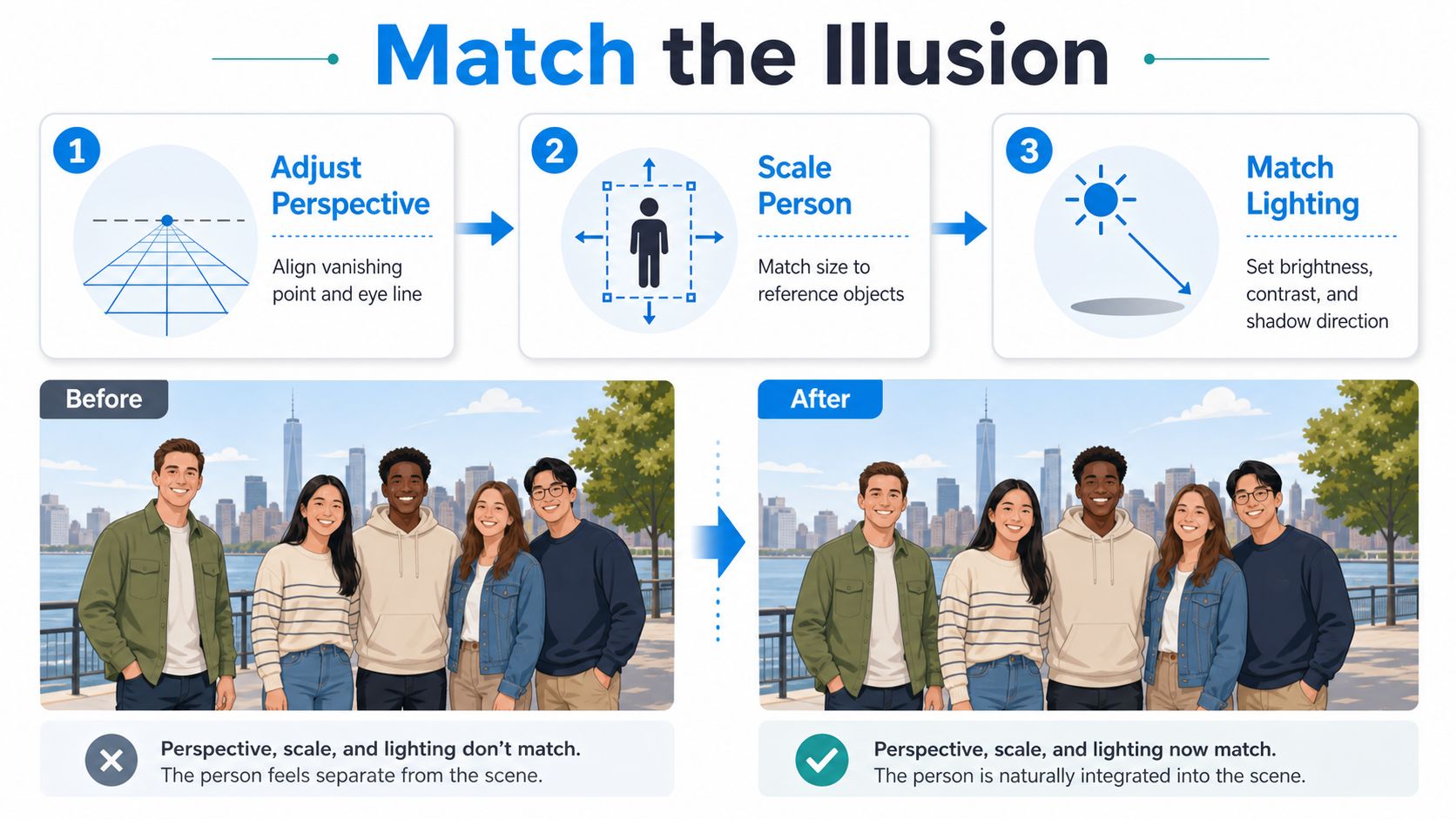
A Simple Diagnosis Pass
If the composite still feels off, run it through a quick check.
- Does the eye line match the scene? If not, the subject may be sitting in the wrong perspective plane.
- Does the subject fit the scale of nearby objects? If not, resize against a real reference.
- Do the shadows point the same way? If not, the light direction is inconsistent.
- Does the subject share the scene's warmth or coolness? If not, the color balance is breaking the illusion.
When those answers line up, the edit starts to feel physical instead of graphic.
Blending Shadows and Grains
Once the placement is right, the realism comes from what happens at the edges and under the feet. Shadows anchor the person to the surface. Grain and texture keep the inserted subject from looking cleaner than the rest of the photo. Those details are small, but they're the part the eye trusts most.
Build the Shadows in Layers
Start with the contact shadow, the darkest area where the subject meets the ground or sits against another surface. Without it, the person looks like they're floating. Then add a cast shadow that follows the scene's light direction, using a layer mode like Multiply when the goal is to darken the background naturally.
Keep the shadow shape tied to the surface. A person on rough pavement casts a different shadow than someone on polished tile or grass. Soft edges help when the light is diffused, while harder edges work better in direct sun. Opacity matters more than intensity here, because a believable shadow usually feels like part of the environment, not a graphic object.
Use Ambient Occlusion at Contact Points
Ambient occlusion is the subtle darkening where the subject overlaps nearby objects or the background presses close to the body. You see it under arms, around shoes, beside sleeves, and where clothing folds meet other surfaces. Without it, the cutout can feel like it's hovering a millimeter above the scene.
A small brush and careful feathering do more than broad edits. Paint gently around the contact zones, then compare the result to the unedited background. If the darkening looks obvious, it's too strong.
Match Grain So the Composite Shares One Texture
A pristine extracted subject dropped into a grainy photo always stands out. The texture mismatch is one of the fastest ways to make an edit feel artificial. If the background has visible noise, the inserted person needs similar grain, or they'll look sharpened and separate.
The easiest way to think about this is texture parity. Don't sharpen the cutout to death and don't smooth the background into plastic. Instead, add matching noise to the inserted subject, then step back and check whether the texture reads consistently across the frame. If the background has a soft camera noise pattern, mirror that quality rather than forcing a clean digital finish.
A family-photo composite often goes wrong right here. The inserted guest looks like a sticker until the shadow is deepened at the feet, the arm contact is darkened, and the grain is unified across the whole image. After that, the edit stops looking pasted and starts looking photographed.
The best blend is the one nobody notices during a first glance.
Common Mistakes to Avoid
The most common compositing mistakes aren't dramatic. They're subtle, and that's why they survive into final exports. A cutout can be technically clean and still fail because the scale is wrong, the shadow is missing, or the image was softened in the wrong place.
Don't Trust the Mask Blindly
AI masks are fast, but they're not self-policing. They often catch stray pixels, miss wispy hair, or include bits of the old background along sleeves and shoulders. If you stop after the automatic step, the edge may be “clean” in a machine sense and still look wrong to a human eye.
The fix is simple, manual inspection. Check the mask at close zoom on a neutral backdrop, then correct the problem areas by hand. That extra minute usually saves you from the ugly halo that shows up only after export.
Don't Use Blur as a Cover-Up
People often reach for blur when the underlying problem is perspective or scale. A soft edge can help a subject sit farther back, but it won't solve a body that's too large for the scene or a head that's floating at the wrong eye level. Blur hides detail, it doesn't create physical logic.
Ask yourself a direct question. If you remove the edge softness, does the problem get worse, or does it just expose the issue? If the answer is the second one, you need to fix placement, not blur.
Don't Over-sharpen the Inserted Person
Over-sharpening creates a crunchy subject that feels pasted on top of the photo. The eye notices that the subject has been pushed harder than the environment, especially around hair, fabric, and facial detail. The same goes for over-clarity and over-contrast on a cutout that doesn't match the rest of the frame.
A better habit is to compare the subject's detail level against the background before sharpening anything. If the photo is soft, keep the inserted person soft enough to belong there. If the scene is crisp, sharpen carefully and only after the color and shadow work are done.
Don't Skip Final Color Unification
Even good shadows won't save a composite if the subject and background still feel like different photos. Final color unification is where the whole scene becomes one image. That means checking the whites, mids, and darks so nothing screams “separate source file.”
A simple self-check helps:
- Missing shadows? The subject will float.
- Wrong scale? The scene loses depth.
- Bad edge cleanup? The cutout looks traced.
- Different grain? The subject looks pasted.
- Color mismatch? The image feels assembled, not captured.
Run that check before you export. It catches more bad composites than any single tool does.
Quick AI Workflows and Tool Recommendations
You don't need to do every part of this manually. The fastest workflow is usually a hybrid one, where AI handles the repetitive extraction and cleanup while you make the judgment calls that matter, like scale, shadow direction, and final realism. That mix is especially useful when you're moving fast between social content, mockups, or client previews.

Where AI Helps Most
AI background removers are strongest when the subject edge is clear enough for the model to detect without much ambiguity. They're also useful when you need a first-pass cutout quickly and plan to refine it afterward. For low-resolution source images, upscaling tools can help restore usable detail before compositing.
For editors who work with multiple image styles, it helps to think in terms of workflow fit, not just feature lists. A tool built for quick subject swapping may be ideal for social content, while a deeper editor is better when you need precise control over matte cleanup, lighting, and the background itself.
If your project is about fashion or product visuals, the same logic appears in other AI image workflows, including photos with AI fashion models. The use case is different, but the lesson is the same, the image still has to look like it belongs in a real visual environment.
A Practical Fast Workflow
A simple AI-assisted sequence usually looks like this. First, pick the best source pair. Then remove the background, place the subject, and fix the placement before touching shadows or texture. After that, use generative fill or background repair only where the original scene needs reconstruction around the inserted person.
That order matters because it keeps you from polishing the wrong thing. There's no point perfecting grain if the scale is off. There's no point building shadows if the subject is still sitting in the wrong part of the frame.
Tools Worth Comparing
Photoshop is still the strongest choice when precision matters. GIMP can work if you're comfortable with manual control, though it asks for more effort. AI-native tools are faster for extraction and quick scene edits, but they still benefit from a human pass before export.
A practical rule is simple. Use AI to move faster, not to skip judgment. The software can remove the background, but it can't decide whether the person belongs in the light, scale, and mood of the scene.
Wrapping Up Your Edit
A believable composite comes together in the same order every time. Choose source photos that already share the right camera feel. Extract the subject cleanly. Match perspective, scale, and lighting. Then finish with shadows, contact darkening, and grain so the whole frame reads as one photograph.
The shift is mental. Stop treating the edit like a cut-and-paste task and start treating it like visual storytelling. Every edge, shadow, and color choice should support the same question, does this person look like they were there?
Step away for a minute before you call it done. Look again with fresh eyes, squint at the image, and check whether anything floats, glows, or feels too crisp for the scene. If it passes that test, you're close.
If you want a faster way to build and refine composites without getting buried in repetitive steps, visit Aicut. It gives you a practical way to move from source images to polished edits while keeping control over the parts that affect realism most.