
You're probably getting images that look good for half a second, then fall apart the moment you pause, zoom, or try to build a video around them. Skin looks waxy. Hands drift. Backgrounds feel sterile. The frame has that polished-but-fake look that instantly tells viewers, “this came from AI.”
That gap is where most creators get stuck.
A realistic AI image isn't just a nicer prompt. It's a production workflow. You need the right model for the shot, a prompt written like a camera setup, quality controls that keep details coherent, post-production that adds believable flaws, and a final video pass that gives the still image motion and context. Skip one of those steps and the result usually looks synthetic, even when the idea is strong.
From Artificial to Authentic The Quest for Realism
The biggest mistake creators make is treating realism like a style preset. It isn't. Realism comes from stacking small correct decisions until the image stops feeling generated.
That matters more now because AI images aren't niche anymore. Approximately 80 million AI images are generated daily worldwide by more than 150 million monthly users as of 2026, according to AI image generation statistics compiled by Imagera. Once that much content floods feeds, average output disappears into the background. Clean but generic no longer works.
What stops the scroll now is believability.
What realism actually means
When I judge whether a frame feels real, I don't start with beauty. I check for mundane things:
- Lighting logic: Does the light direction match the shadows?
- Surface truth: Do skin, denim, glass, metal, and walls all carry the right texture?
- Lens behavior: Does the background blur like an actual lens, or like smeared software?
- Scene imperfections: Is there enough noise, grain, unevenness, and optical mess?
Most failed generations break on one of those points.
Practical rule: If the image looks too perfect, it usually looks fake.
Why short-form creators need a higher standard
For short-form video, a realistic still has to survive motion. The moment you add a push-in, parallax, subtitle overlay, or cutaway edit, weak details become obvious. Faces wobble. Jewelry melts. Textures flatten. What looked acceptable as a thumbnail starts failing as footage.
That's why casual prompting doesn't hold up. The workflow has to produce an image that can survive being animated, cropped vertically, and shown for more than a blink.
A realistic AI image should do three jobs at once. It should catch attention in-feed, hold up under editing, and give you enough visual coherence to build a sequence around it.
Choose Your Realism Engine and Model
Tool choice shapes the entire job. If you pick the wrong model, no amount of prompt tweaking will fully rescue the output.
Some models are strong at skin, materials, and lighting. Others are strong at text. Some make beautiful one-off images but struggle to keep a person looking like the same person from shot to shot. That distinction matters if you're making ad creatives, fake documentary scenes, product shots, or faceless short-form sequences.
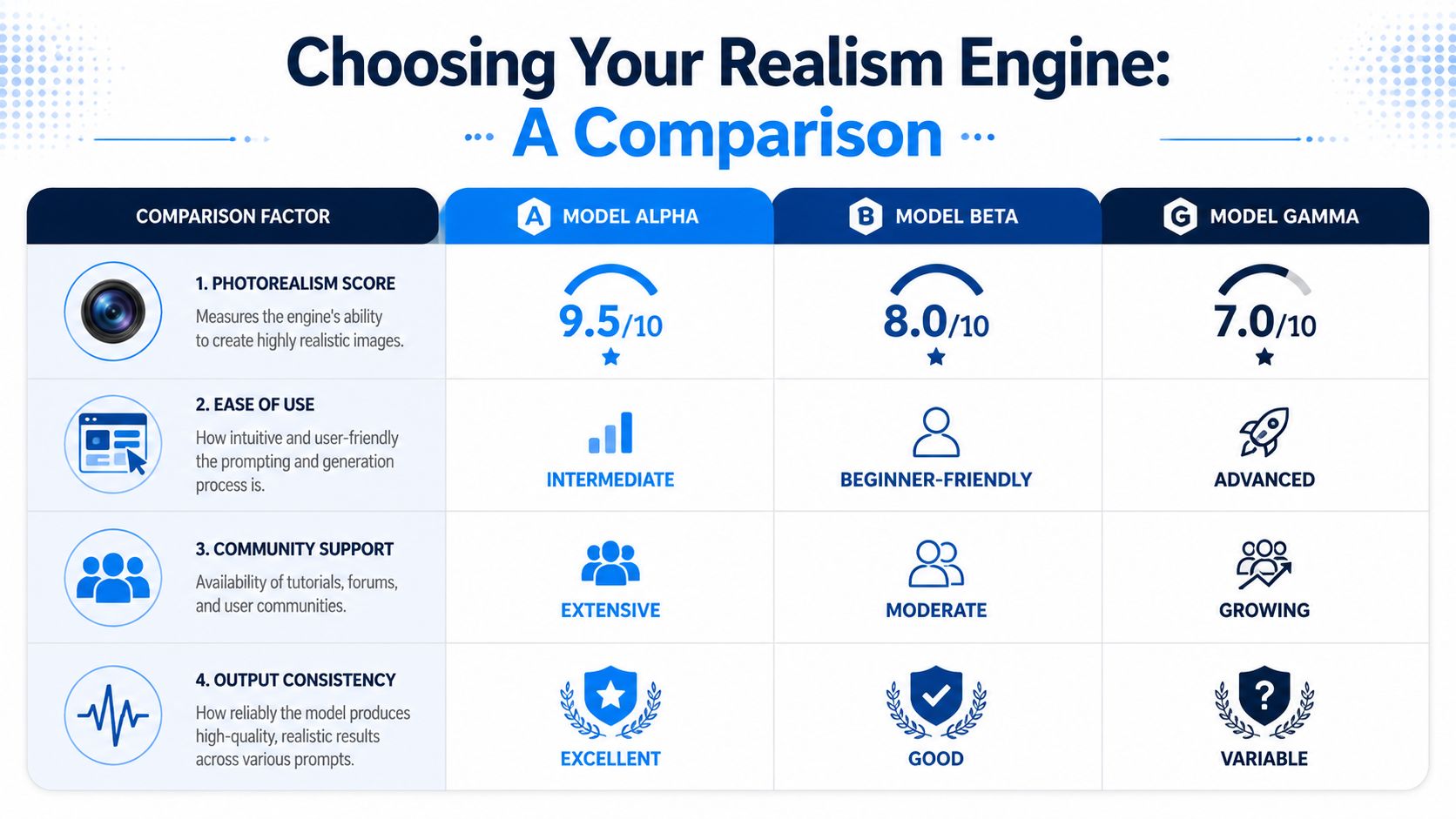
Match the model to the shot
If the image needs readable signage, labels, packaging, or title text inside the frame, use a text-capable model first. Ideogram reaches about 90% text rendering precision, while Midjourney reaches about 30% success for short phrases, based on MindStudio's model comparison. For logos, storefronts, magazine covers, menus, posters, and product packaging, that difference is the whole project.
If the frame doesn't need text and your priority is straight photoreal detail, the same source notes that Nano Banana Pro and FLUX Pro dominate high-detail 4K photorealism, and FLUX.1.1 Pro delivers 4.5-second generation times with near-professional photographic quality. That makes them practical when you need lots of test generations quickly.
Where each model tends to win
Here's the way I'd break it down in practice:
- FLUX Pro: Strong for product scenes, cinematic stills, objects, interiors, and realistic lighting.
- Nano Banana Pro: Good when you want high-detail realism without fighting too hard for texture quality.
- Ideogram: Use it for scenes with embedded text that needs to read correctly.
- Midjourney: Useful for mood, composition, and visual taste, but less reliable when readable text or locked character identity matters.
For a broader tool roundup focused on realism, the Aicut article on realistic image generator tools for 2025 is a useful shortlist.
Three buying criteria that matter more than hype
Most creators compare models based on feed screenshots. That's not enough. Judge them on these three points instead:
| Criteria | What to check | Why it matters |
|---|---|---|
| Texture fidelity | Skin pores, fabric weave, reflections, hair detail | This decides whether the frame survives zooming and motion |
| Lighting accuracy | Shadow direction, skin highlights, window light falloff | Lighting mistakes are one of the fastest ways to spot fake images |
| Identity stability | Same face, hairstyle, age, build across variations | You need this for scenes that become a sequence |
Character consistency is where many polished image models still become frustrating. If your project depends on the same person appearing across multiple frames, plan for extra control methods rather than assuming the model will hold likeness on its own.
Use one model for generation and another for cleanup when needed. A single-tool workflow is convenient, but mixed-tool workflows usually look more professional.
If you're comparing budget before committing to one ecosystem, this comprehensive guide to Midjourney expenses helps set expectations.
Prompting Like a Photographer Not a Painter
Most bad AI prompts read like concept art briefs. That's why the output feels illustrated, even when the model is capable of realism.
A strong prompt for a realistic AI image reads like a shot list from a photographer or cinematographer. You're not asking for “a beautiful woman in a cafe.” You're defining focal length, light source, camera distance, depth of field, material cues, and environmental conditions.
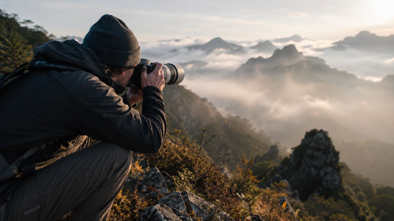
The prompt formula that actually works
A practical formula looks like this:
Subject + setting + camera + lens + aperture/depth + lighting + texture cues + mood + realism constraints
That sounds technical, but it gets easier fast. Instead of writing broad adjectives, write physical instructions.
Compare these two prompts.
Weak prompt
Young woman drinking coffee in a trendy cafe, realistic, cinematic, detailed
Better prompt
Candid photo of a woman in her late 20s sitting alone in a narrow cafe near a rain-streaked window, shot on a 50mm lens at f/1.8, shallow depth of field, soft window light from the left, natural skin texture, slight under-eye detail, subtle flyaway hair, ceramic cup steam visible, dark wood table reflections, handheld framing, muted morning color palette, documentary photo realism
The second one gives the model constraints it can use.
Think in lens choices
Lens language changes composition more than most creators realize.
- 35mm lens: Feels natural and environmental. Good for street scenes, lifestyle shots, interiors.
- 50mm lens: The safest default for portraits that should feel photographic without distortion.
- 85mm lens: Better for compressed portraits, beauty close-ups, and isolated subject shots.
- Wide angle: Useful sparingly. It often creates exaggerated perspective that can make faces look synthetic if pushed too far.
Use lighting instructions with physical direction
“Cinematic lighting” is vague. “Soft window light from frame left” is useful.
Try writing lighting this way:
- Soft daylight through sheer curtains
- Golden hour backlight with warm rim light on hair
- Harsh overhead convenience store fluorescents
- Single practical lamp lighting the right side of the face
- Cloudy outdoor light with low contrast shadows
Those phrases create more believable scenes because they describe how light behaves, not just how you want the image to feel.
Most models respond better to directional lighting than emotional lighting terms.
Add texture and imperfection on purpose
The source from MindStudio notes that realistic prompting benefits from technical camera language such as lens type, f-stop, ISO, and lighting direction, and it also highlights the use of reference images to recreate exact photographs. That's the right mindset. Build texture directly into the prompt.
Useful texture cues include:
- Natural skin texture, visible pores
- Subtle film grain
- Slight sensor noise in shadows
- Wrinkled cotton shirt
- Dust particles in window light
- Weathered concrete wall
- Fingerprint smudges on phone screen
- Uneven lipstick edge
These details stop the model from over-smoothing everything.
Negative prompts that clean up the frame
Negative prompting is less about magic words and more about removing common failure modes. If your tool supports negative prompts, keep a reusable cleanup string.
A practical base set:
- plastic skin
- overprocessed face
- extra fingers
- symmetrical fake face
- warped background
- melted jewelry
- oversaturated highlights
- cartoon texture
- airbrushed skin
- incorrect shadows
- duplicate objects
- deformed hands
- unreadable text
Prompt templates for short-form creators
If you need templates you can adapt quickly, this image prompt guide from Aicut is a useful reference.
Here are three prompt starters I'd use.
Talking-head realism
A candid smartphone-style portrait of a woman speaking to camera in a small apartment kitchen, 35mm lens, eye-level framing, soft daylight from window on the left, realistic skin pores, slight forehead shine, natural lip texture, background clutter softly blurred, handheld feel, documentary realism, no beauty retouching
Product ad realism
Studio product photo of a glass skincare bottle on wet black stone, 85mm lens, controlled specular highlights, soft top light with side fill, water droplets with realistic refraction, crisp label edges, premium commercial photography, natural reflections, ultra-clean texture detail
Viral story-frame realism
Nighttime convenience store security-camera still of a man in a hoodie at the counter, fluorescent overhead lighting, slight motion blur, timestamp-style framing, low-contrast CCTV look, reflective floor, imperfect white balance, realistic grain, mundane surveillance realism
Mastering Advanced Quality Settings
A strong prompt gets you close. The settings panel gets you repeatability.
Most creators ignore advanced controls because the labels look technical. In practice, you only need to understand what each control does to the image, not the math behind it. The goal is simple: push realism without making the frame stiff, oversharpened, or unstable.
CFG scale and why too much hurts realism
CFG scale controls how aggressively the model obeys your prompt. When it's too low, the result may drift and ignore important shot details. When it's too high, the image often becomes brittle. Skin gets overcooked. Composition feels forced. Small artifacts show up because the model is trying too hard to satisfy every word.
For realism, I usually want prompt adherence, but not blind obedience. If a generation looks sterile or overly literal, lower the guidance slightly and rerun. If it keeps ignoring key setup details like lens feel or lighting direction, raise it a bit.
Samplers and detail behavior
Different samplers change how the final image resolves texture and coherence. You don't need to memorize a ranking chart. You need to test which options in your tool give you these outcomes:
- Sharper micro-detail
- Cleaner edges
- Better facial stability
- Less muddy shadow noise
If one sampler gives you sharp pores but breaks earrings and fingers, it isn't the right sampler for that shot. For portraits, I prioritize face stability over raw crispness. For product images, I'll often accept a slightly more clinical look if edges and materials stay consistent.
Seed control for consistency
The seed is one of the most useful controls in the whole workflow. When you get a generation with the right face, framing, and mood, save the seed immediately.
Then use it in two ways:
- Create controlled variations by changing only one input at a time, such as wardrobe, background, or camera distance.
- Lock a visual direction for a multi-image sequence so your shots feel related rather than randomly generated.
This is especially useful when you need a short-form story to hold together visually.
Save prompts, seeds, and model names in the same note. A good image you can't reproduce is just luck.
Resolution and steps
For realism, low-resolution previews are useful for composition checks, but final selection should happen at the highest practical quality setting your tool allows. More generation steps can improve coherence, but they can also waste time if your prompt or model choice is wrong. If the base image is conceptually off, extra steps just create a cleaner failure.
My rule is simple. Fix the shot first. Then spend more compute polishing it.
Perfect Your Image in Post-Production
Raw generations rarely ship as-is. Professional-looking realism usually appears in the edit, not at the moment of generation.
Many creators leave quality on the table. They get a decent image, accept the native output, and move on. That's fine for casual posting. It's weak for ads, marketplace visuals, print, or any short-form video that pushes in on details.
The core problem is resolution. The LetsEnhance analysis of AI image quality points out a gap between native 1 to 4 MP outputs and the 8 to 180 MP requirements common in professional print and advertising. That's the difference between “looks fine on screen” and “falls apart when used seriously.”

First fix the file, then fix the feel
Post-production has two jobs.
The first is technical. Increase usable resolution, clean artifacts, and make sure fine details survive crop and motion.
The second is aesthetic. Add the subtle flaws that tell the eye this came from a camera and lens, not a generator.
If you reverse that order, you'll often amplify defects instead of realism.
My practical post workflow
Here's the sequence that tends to work:
Select the strongest base frame
Don't upscale a weak image. Pick the one with the best lighting logic, cleanest hands, and least facial weirdness.Upscale before heavy grading
Use your preferred upscaler early so edge detail and texture have room to hold up.Repair obvious failures
Fix fingers, earrings, product labels, warped architecture, broken reflections, and cloned background objects.Add believable imperfections
Introduce subtle grain, tiny lens softness, minor chromatic aberration, and restrained noise in darker areas.Color match for the intended platform
A gritty fake documentary frame shouldn't be graded like a skincare ad.
Imperfections that improve realism
The arXiv detection study in your earlier reading noted that AI often struggles with natural imperfections like film grain, subtle noise, and micro-textures. That aligns with what shows up in editing. A raw AI image can be too smooth and too clean.
Useful finishing touches include:
- Film grain: Keep it subtle. Grain should merge the image, not announce itself.
- Slight blur in non-critical zones: Real lenses don't render every corner perfectly.
- Chromatic aberration: Barely visible on high-contrast edges can help.
- Texture overlays: Concrete, paper, dust, haze, and glass reflections can add environmental credibility.
- Highlight rolloff adjustment: Pull back harsh digital-looking bright areas.
Swap elements without starting over
Sometimes the base image is good except for one thing. Wrong shirt. Wrong face shape. Wrong background object. That shouldn't force a complete reroll.
For image edits and swaps, the Aicut guide to AI image editing covers a workflow for replacing specific elements instead of regenerating the full frame. That approach is useful when you want to keep composition and lighting but correct one asset.
A similar principle applies when using editor-based swaps for characters or backgrounds. Keep the original light direction, camera angle, and scene depth intact. If the replacement ignores those cues, the edit becomes the most artificial part of the image.
Turn Your Image into Viral Video Content
A realistic image that performs in feed rarely starts as a standalone still. It starts as a video shot.
That changes the workflow. The frame needs room for motion, captions, reframing, and a clear story beat. Analysts at Fortune Business Insights on the AI image generator market expect advertising to be the leading end-user segment for AI image generation, which matches how creators already use these assets. The image is the first asset in the video pipeline, not the final deliverable.

Build the frame for vertical video first
For Shorts, Reels, and TikTok, I compose for 9:16 even if I generate wider first. The subject goes slightly above center, negative space stays available for captions, and the edges need enough environment to survive a push-in or crop.
Three checks catch weak frames fast:
- Push-in test: Can the image hold a 5 to 8 second zoom without revealing broken details?
- Layer test: Is there clear foreground, midground, and background separation for parallax?
- Caption test: Will the core subject still read once text covers the lower third?
If a frame fails one of those, I regenerate before editing. Fixing a weak source in motion takes longer than making a better base image.
Turn one image into a usable shot sequence
A single realistic image can produce several cuts if the composition is strong. I usually build a short sequence from one master frame before generating more assets.
Typical shot order:
- Wide crop to establish the scene
- Medium crop for the main subject
- Tight crop on the face, hands, or product detail
- Slow horizontal move across the environment
That gives the edit pacing without asking the model for full scene consistency across multiple generations. It is one of the fastest ways to get a polished faceless video from a single strong image.
Here's a visual walkthrough worth watching before you animate a batch of assets:
Use restrained motion, not effect-heavy motion
Small moves look more believable. Slow zoom, light camera drift, soft parallax, and selective foreground movement usually outperform aggressive pans or fake 3D swings.
The trade-off is simple. More motion feels exciting for one second, then starts exposing anatomy mistakes, warped edges, and texture failures. Subtle motion keeps attention on the story and buys you realism.
A practical rule: if the motion effect is the first thing you notice, it is probably too strong.
Add the pieces that make the short watchable
The image gets the stop. The edit gets the watch time.
For short-form video, that usually means:
| Layer | What to do |
|---|---|
| Hook text | Put the first line where it does not block the subject |
| Voiceover | Match the tone of the image. Calm visuals need calm delivery |
| Captions | Keep them readable and high-contrast, not oversized |
| Sound design | Add light room tone, impact hits, or texture, not constant noise |
| Pacing | Change crop or motion every few seconds to avoid a static feel |
This is also where Aicut fits practically in the workflow. It can turn generated images into short-form videos with templates, voiceover, captioning, and publishing tools in one production flow.
What separates amateur edits from pro edits
The biggest gap is not the prompt. It is edit discipline.
Amateur versions often stack motion, captions, transitions, music, and filters all at once. Pro versions protect the frame. They leave breathing room, keep movement controlled, and cut only when the next crop adds information.
The realistic images that perform best in video usually share four traits:
| Video trait | Why it matters |
|---|---|
| Clear focal subject | Viewers understand the frame in a split second |
| Depth separation | Motion effects feel natural instead of flat |
| Visual tension | The shot suggests a story before the narration explains it |
| Editable margins | You have space for captions, hooks, and reframing |
For faceless channels, build in batches. Generate one visual concept, cut it into multiple shots, add narration and captions, then package it in the format your audience already watches. That is how one realistic image turns into a repeatable content system.
FAQ Your Realistic AI Image Questions Answered
Realistic image generation gets easier once you have a system, but a few questions keep coming up. Most of them aren't about prompts. They're about what's safe to publish, what's hard to control, and where the biggest failure points still are.
Quick answers to common questions
| Question | Short Answer |
|---|---|
| Can I use AI-generated realistic images commercially? | Sometimes, but only after checking the terms of the model and platform you used. Commercial rights vary by tool and plan. |
| Why do my images still look fake even with a good prompt? | Usually because of lighting mismatch, over-smooth skin, weak textures, or a base model that isn't suited to the shot. |
| What's the hardest part of realism right now? | Consistent identity across multiple images and believable small details under close inspection. |
| Which model should I use if the image contains text? | Use a text-strong model rather than forcing a photoreal model to fake signage or packaging copy. |
| Should I generate images of real people? | Avoid doing that without clear consent, especially for identifiable private individuals. |
| Why do AI hands and accessories still fail? | Small geometry and repeated fine structures remain fragile in many generations, especially under tight crops. |
Can people tell when an image is AI?
Sometimes yes. Often not reliably.
A recent paper reports that human detection accuracy for AI-generated images remains around 62 to 63%, and visual professionals achieved 62.09% success in identifying AI images, which the authors frame as a serious weakness for authenticity checks in professional workflows. You can read that in the arXiv paper on human detection of AI-generated images.
That doesn't mean creators should try to deceive people recklessly. It means realistic outputs are already good enough to confuse viewers, so ethical judgment matters more, not less.
How do you keep the same character across many images?
Use every consistency aid available:
- Lock the seed when you get a strong starting face
- Reuse a narrow prompt structure instead of rewriting from scratch each time
- Keep age, hair, wardrobe, camera angle, and lighting stable
- Use reference-based workflows when the tool supports them
- Edit selectively instead of regenerating the whole image
If the project depends on recurring characters, plan for iterative correction. One-pass generation usually isn't enough.
What's the ethical line with realistic AI people?
Don't create fake images of real identifiable people without consent. Don't generate misleading scenes that could damage someone's reputation. And don't assume “it's obviously AI” protects you, because many viewers won't identify it confidently.
The safer path is simple. Create fictional people, stylized composites, or clearly disclosed AI visuals when the context could be sensitive.
Why does my image fail when I print it or animate it?
Because screen-level realism and production-level realism aren't the same thing. A frame can look convincing in a small preview but break under zoom, motion, or high-resolution export. That's why upscaling, cleanup, and texture finishing are part of the process, not optional extras.
If your image only works at a glance, it isn't done yet.
If you want a faster path from realistic image generation to finished short-form content, Aicut is worth testing. It gives creators a way to turn images into faceless videos with templates, prompt cloning, voiceovers, editing tools, and publishing in one workflow.