
You can post five times in a day, open every analytics tab you have, and still feel unsure about what moved. One Reels spike looks encouraging, TikTok says the hook worked, YouTube Studio says retention dipped, and your client asks why conversions didn't follow. A social media analytics dashboard solves that mess by putting the signals in one place, so you can stop guessing and start changing the right part of the content.
Why Creators and Managers Need a Unified Dashboard
A faceless creator I worked with used to start every Monday by opening Instagram Insights, TikTok Analytics, YouTube Studio, X analytics, and a Facebook Page tab, then copying numbers into a spreadsheet that never quite agreed with itself. Each platform used its own labels, its own time zone, and its own logic for what counted as a view or an interaction. By the time the report was ready, the useful part of the week had already passed.
A unified dashboard fixes that workflow because it centralizes performance across platforms in one interface, which is now the baseline operating model for social reporting. Modern dashboards don't stop at vanity metrics, they also bring in paid performance, share of voice, profile visits, website clicks, ROAS, and social media ROI in the same reporting layer, which matters when your job is tied to business outcomes, not just reach. That shift from audience counting to business attribution is exactly why social reporting became more valuable as platforms matured into measurable media and sales channels, not just publishing tools social media analytics dashboard.
For creators, the payoff is practical. Instead of wondering whether a drop in views came from weaker hooks or a posting lull, you can compare channels side by side and see where the pattern started. For agencies, the benefit is cleaner storytelling for clients, because the dashboard shows what happened, what changed, and where the next adjustment should go.
Practical rule: If a metric can't change a creative decision, a cadence decision, or a budget decision, it probably doesn't belong on the first screen.
That matters even more when you're budgeting for tools, editing, and distribution. If you're trying to understand the cost side of a content operation, Kraken Socials has a useful breakdown on how much social media costs, which pairs well with dashboard planning because it forces you to think about reporting in the same way you think about spend.
Foundational KPIs Every Dashboard Must Track
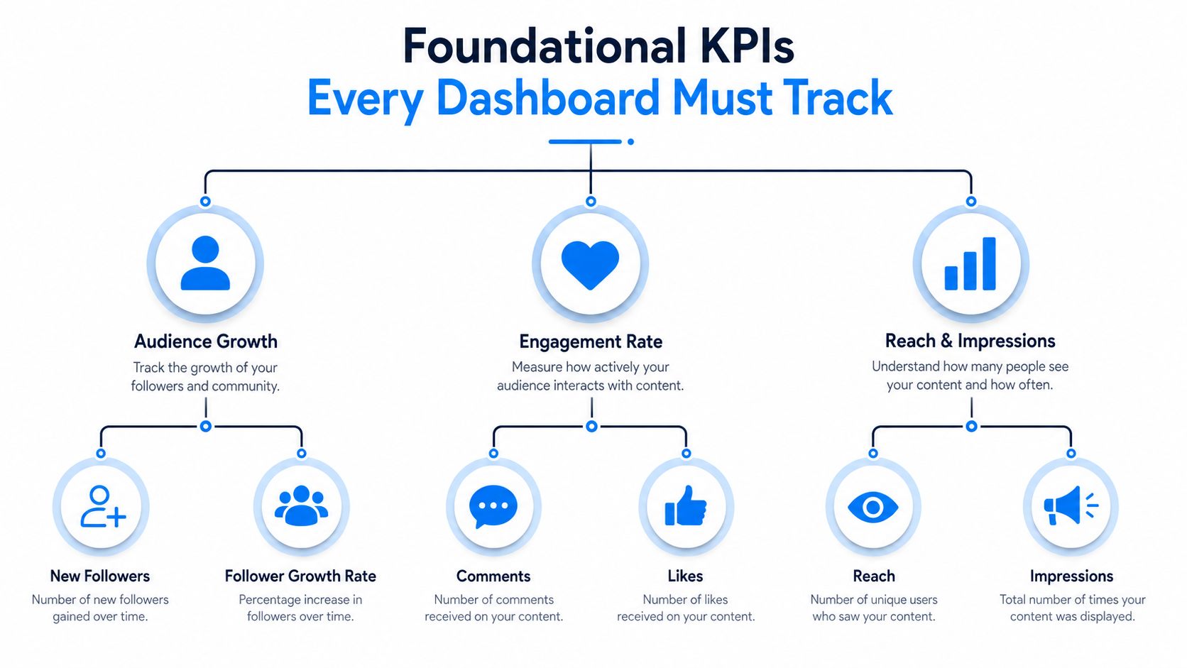
A dashboard gets messy fast when it tries to track everything. The useful ones stay anchored to a small set of foundational KPIs, so creators and managers can compare performance across platforms without translating every report by hand. The core distinction is straightforward, reach measures unique users exposed to content, impressions counts total displays including repeat views, and engagement rate shows the share of viewers or followers who interacted with the post. For a broader breakdown of how to turn engagement signals into decisions, the engagement metrics guide from Aicut is a useful reference.
The metrics that deserve first-screen space
For most creators and managers, the first group should be reach, impressions, engagement rate, clicks, and conversions. Those five tell you whether distribution is expanding, whether the content is earning attention, whether people are taking action, and whether that action leaves the platform. For short-form video creators, that set is the backbone of hook testing, retention analysis, and offer testing.
Clicks and conversions matter because they connect social activity to outcomes beyond the feed. A post can look strong in isolation and still fail if it doesn't move viewers toward a landing page, a product, a signup, or a profile visit that matters to the business. That is why dashboards should support time-series analysis, not just snapshots. The review layer is where you separate a post that got attention from one that drove movement.
How to read trend lines instead of isolated posts
A strong dashboard tracks follower growth, audience engagement, and click-through rate across reporting periods, then shows whether the line is rising, flattening, or falling. Historical trend lines for impressions, clicks, and conversion rate are standard because they show whether content is improving over time, not just whether one post caught a lucky wave. For example layouts that put these metrics into a working reporting frame, Databox is a useful point of comparison.
The internal logic is simple. If reach grows while engagement rate falls, your distribution is broad but the content may be too generic. If clicks rise but conversions lag, the mismatch probably sits on the landing page or offer side, not in the post itself. If follower growth climbs but engagement stays flat, you may be attracting people who do not match the channel's core value.
For engagement-specific thinking, the practical framing on turn engagement signals into decisions is useful, and the internal engagement metrics guide can help keep the dashboard tied to action instead of vanity.
A simple dashboard usually only needs five to seven metrics. Add more only when a number changes a decision, because every extra widget competes for attention and slows down the review.
Designing the Ideal Dashboard Layout and Widget Hierarchy
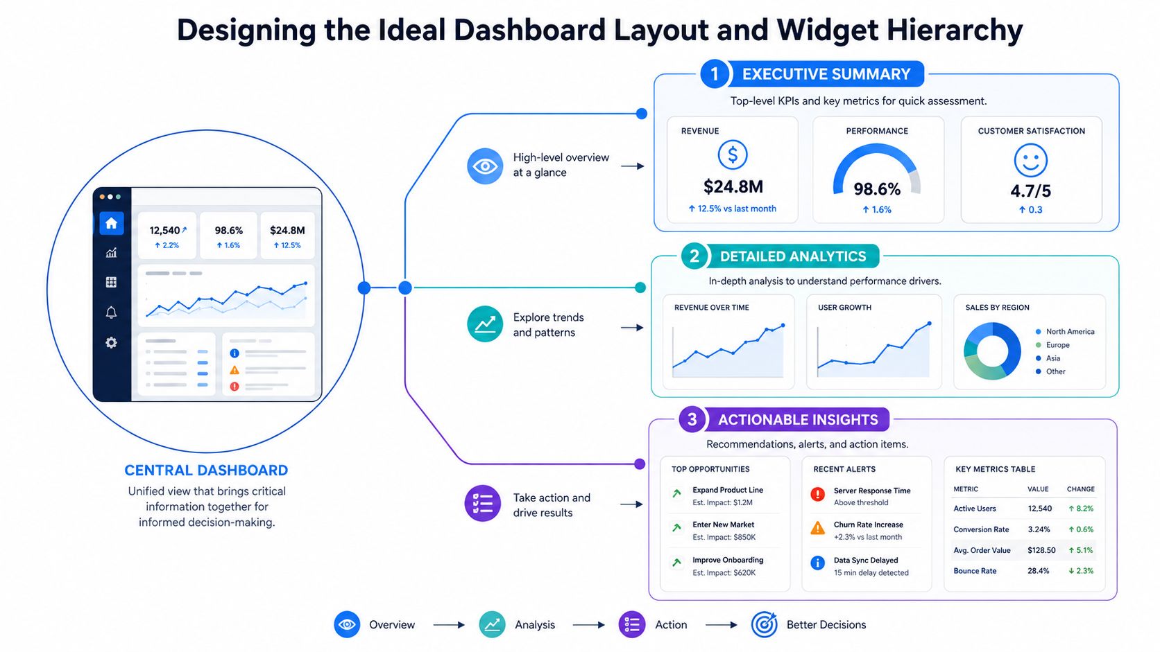
A dashboard can have the right metrics and still waste time if the layout forces people to hunt for them. For short-form video creators and faceless channels, the strongest pattern is a time-series plus summary hybrid. The top row carries the headline numbers, the middle section shows what changed, and the lower layer explains which hooks, formats, or posting windows drove the shift. That structure fits the way social media managers review performance, especially when they are switching between client work, creator accounts, and tools like Aicut's social media management tools for agencies.
What belongs in the top row
The first row should answer three questions fast. Are we growing, are people responding, and is the content sending traffic or profile actions? Summary cards for growth, reach, engagement, and a traffic indicator tied to clicks or profile activity do that well.
That row should be easy to scan in seconds. Use it for direction, not diagnosis. If the headline number sits below the fold or gets buried beside decorative widgets, the layout is already working against the review process.
Where the deeper widgets belong
The middle of the dashboard is where trend charts earn their place. Put time series for reach, engagement, clicks, and conversion behavior there so you can see whether this week is tracking with the last one or breaking from it. Keep the charts aligned horizontally when possible, because uneven blocks make it harder to compare movement across platforms.
The bottom section should hold the evidence. That is where the top three posts by engagement rate and UTM-tracked clicks to a conversion destination belong, because those fields connect content choices to downstream outcomes social.kit. If a creator asks which format to repeat or which hook produced the click, this layer gives a direct answer.
Short-form teams usually get more value from one clear drill-down table than from three extra summary cards. A faceless channel might use it to compare hook style, opening frame, and retention by post, while an agency team may sort the same table by client and campaign. The layout should make those comparisons obvious without forcing a second dashboard.
Keep summary cards clean, trend charts honest, and drill-down tables ugly in the best way. They are there to answer a question, not win a design award.
If you are building in a general BI environment, the logic behind Power BI dashboard building fundamentals fits this hierarchy well. The same ordering rules apply whether the build lives inside a dedicated social tool or a broader business intelligence stack.
Connecting Data Sources and Automating Refreshes
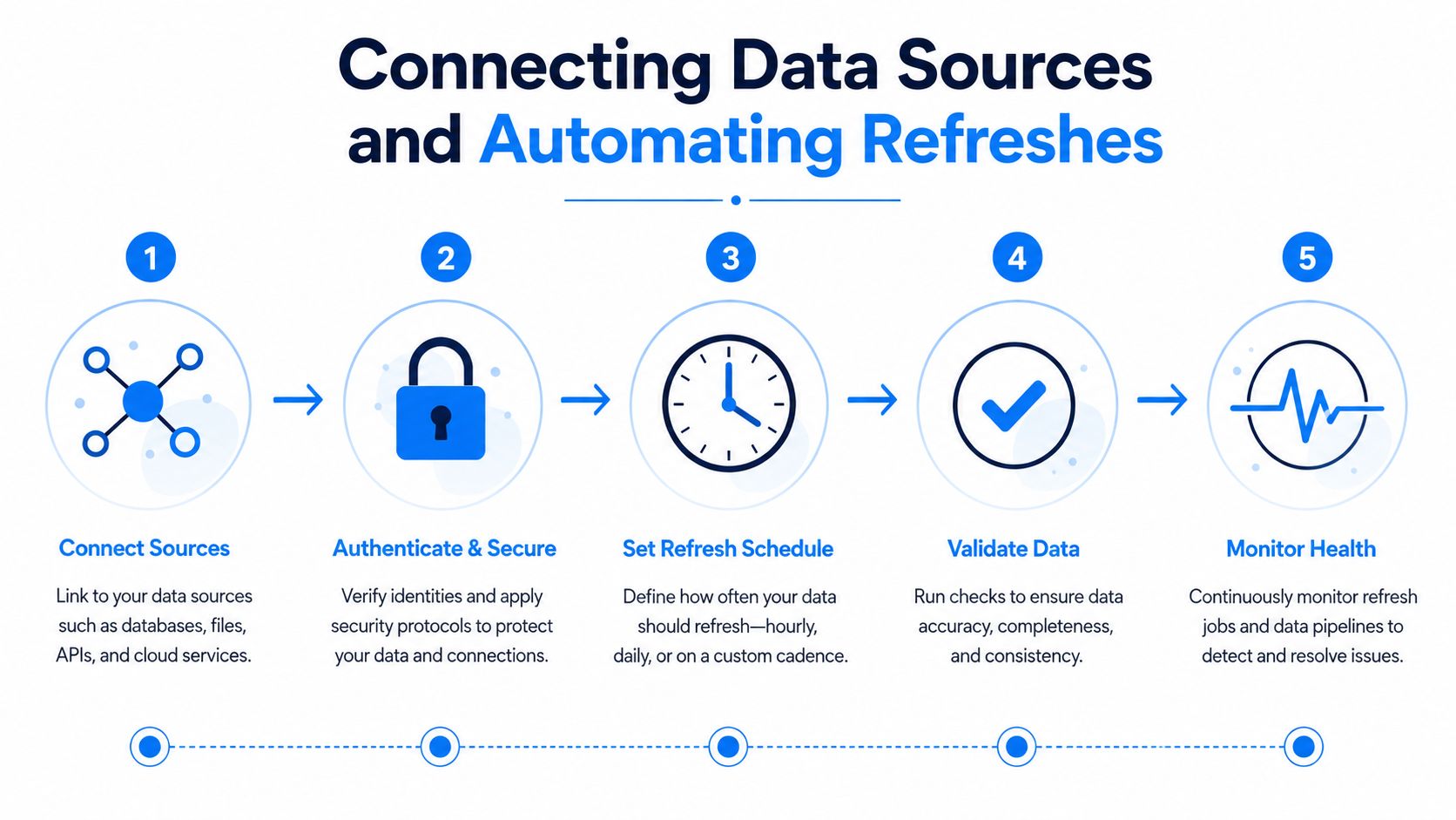
A dashboard looks polished on the surface, but the work happens underneath. A solid build needs an ETL layer that authenticates to each platform API, schedules refreshes, transforms different metrics into a common schema, and stores the data in a database before anything reaches the charts. In practice, that pipeline is where many in-house dashboards break down, especially when teams connect once and assume the feed will stay reliable without maintenance.
The plumbing that keeps data trustworthy
A clean setup starts with the platforms you publish on, then secures the authentication flow so data can refresh without someone exporting CSVs every week. After that, the pipeline should normalize fields so a click means the same thing across sources and a follower count does not get treated like a view count. The goal is not to flatten every platform into the same shape, it is to make the dashboard readable without second-guessing what each number means.
Automated refreshes should run on an hourly or daily cadence when the numbers need to support operational decisions. If a creator is checking whether a hook is catching early or a post is losing steam, stale data gets in the way fast. Native exports still matter for audits and one-off reviews, but they do not replace live connections.
Platform reality and tool choice
YouTube, TikTok, Instagram, and X all expose different data structures, and the common schema matters most once those sources are combined. The more platforms you connect, the more you need refresh logic, validation, and health checks that work without manual babysitting. If an account disconnects or a field stops mapping, the team should know before the weekly review.
For teams that want a managed workflow instead of stitching together exports, Aicut's social media management tools for agencies are one example of a system that sits closer to the publishing side while still tying account activity back to performance. That setup fits creators who want posting, views, and reporting in one place instead of across several separate tools.
The YouTube embed below is useful if you want a visual walkthrough of the connected reporting workflow.
A dashboard breaks the moment refreshes go stale. Once that happens, the problem is usually the data pipe, not the chart design.
Using Dashboard Insights to Iterate Short-Form Video Content
Short-form video usually lives or dies in the first few seconds, so the dashboard should help you test hooks instead of only summarizing views. When I review a faceless channel, I look at views, average watch time, retention curves, and conversions together, because those four signals show far more than any single metric. A clip can reach a lot of people and still fail if viewers leave before the core idea lands.
What the numbers should tell you
If the retention curve drops early, the first move is usually a hook swap, not a new editing style. If the same template keeps producing a better engagement rate, keep the structure and change the topic, the character, or the opening line. If reach is healthy but clicks are weak, the CTA may sit too far downstream or feel too vague for the format.
A unified dashboard turns that review into creative infrastructure. It lets you compare a UGC-style clip against an AI-generated faceless story, then see which one drew the stronger response without digging through separate platform tabs. For channels built on templated production, that feedback loop separates random posting from repeatable iteration.
How to turn review sessions into edits
A practical weekly workflow stays simple.
- Check the first drop in retention. If viewers leave early, the opening needs a different hook, a faster reveal, or a clearer payoff.
- Compare formats, not just topics. A template that works for one story type can fail for another, even when the subject is strong.
- Watch posting cadence against reach trends. If a posting pattern is driving weaker distribution, adjust the schedule before changing the creative system.
- Match the offer to the video. A strong clip with weak clicks often needs a tighter bridge to the next step.
Aicut fits into that feedback loop because it supports prompt cloning, character swaps, background changes, scheduling, and one-click posting, which makes it easier to test variations quickly. For a short-form creator, the dashboard can point to a problem, and the production workflow can respond fast enough to matter.
Don't wait for a monthly report to change a hook. If the curve shows the opening failed, the next upload should already be different.
Dashboard Templates and Mockups for Different Use Cases
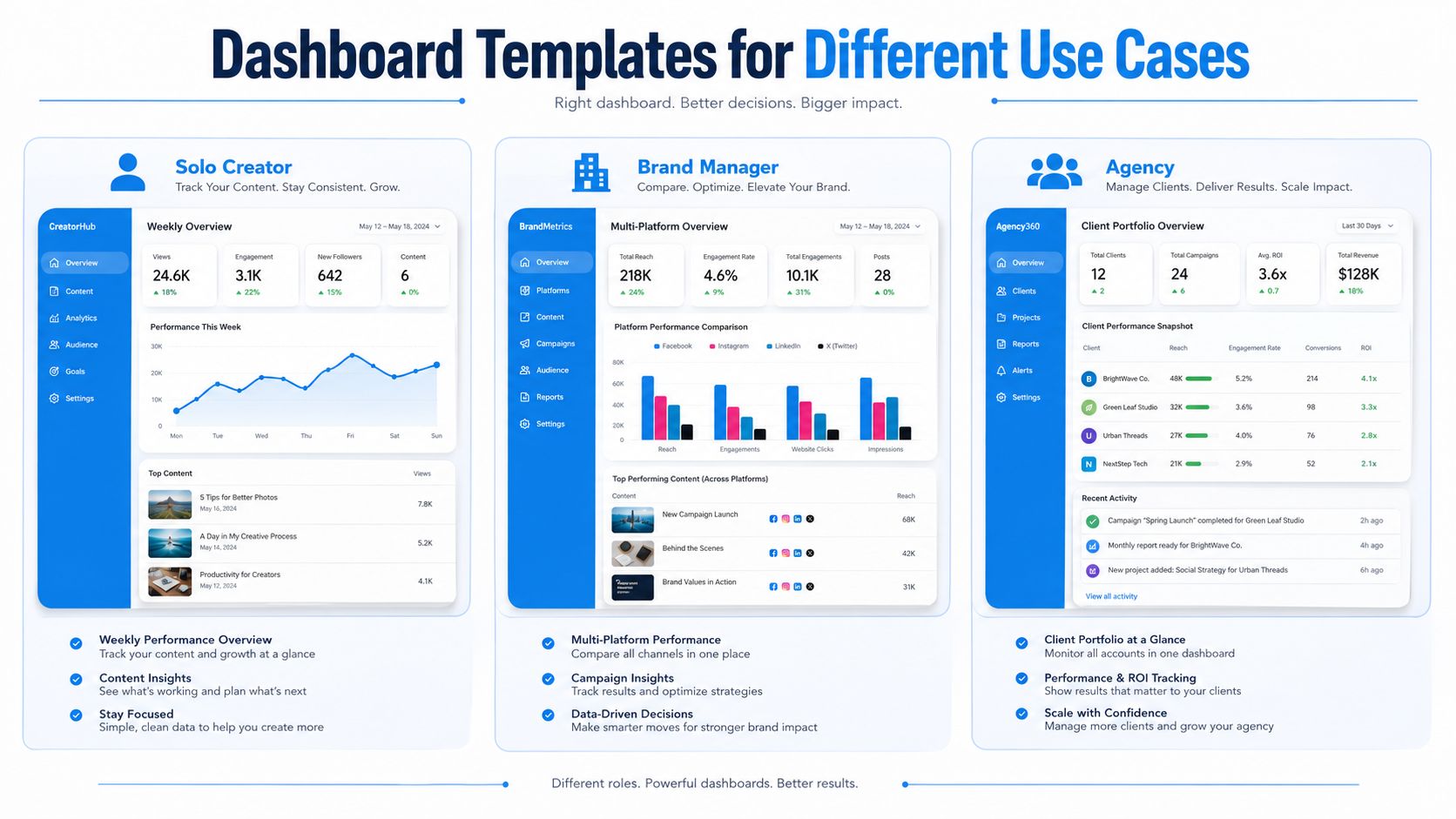
A dashboard that works for a growth team can be a poor fit for a solo faceless creator. Agencies, brand managers, and individual creators need different levels of depth, and forcing them into the same layout usually creates clutter that slows review. Start with the simplest template that answers the next decision on the calendar, then add only the widgets that change what gets published next.
Solo creator template
A solo creator's view should stay tight. Weekly performance cards, a reach trend, a retention chart, and a table of top posts are usually enough. For a faceless channel, the point is to spot which hooks hold attention, which formats fall off early, and whether the posting pattern is helping or hurting distribution.
Keep the layout focused on pattern recognition. A thumbnail grid with post-level metrics can help you see whether a recurring structure, voiceover style, or pacing choice is pulling its weight, while a separate notes area can track the edits you want to test next. That kind of setup matters more than a broad platform comparison, because short-form channels usually improve through repeated creative adjustments, not by staring at a long list of vanity metrics.
Brand manager template
A brand manager needs cross-platform visibility, especially when one channel drives awareness and another drives traffic. This template should compare reach, engagement, clicks, and conversion behavior side by side, with a small section for profile visits and campaign notes. The layout needs to make it obvious which platform is carrying the message and which one is slowing it down.
For short-form campaigns, the most useful view is the one that shows how a video performs after the initial view spike. Brand teams often care less about raw impressions than about whether the content created enough lift to justify the next spend, the next post, or the next variation. If a format keeps getting views but never moves clicks or site actions, the dashboard should make that gap impossible to miss.
Agency template
An agency dashboard should prioritize client separation and reporting clarity. Portfolio-level summaries, client tabs, paid performance, and conversion-oriented widgets belong here, because the audience is usually a mix of marketers and decision-makers. The report has to look polished without hiding the underlying data story.
Agencies also need clean comparisons between accounts, not just prettier charts. A useful template separates client work by campaign, content type, and outcome so a strategist can explain why one faceless series is holding attention while another is stalling after the opening seconds. That keeps the dashboard useful for review calls, internal QA, and client-facing reporting without turning it into a wall of disconnected metrics.
If you're using a templated creative system like Aicut's Cheating Fruits or AI Skeleton Stories workflows, the solo dashboard can stay lighter because the production process is more repeatable. For teams that want to turn performance patterns into faster content changes, how to automate social media posts is a practical reference point for connecting scheduling and output. Agencies need more comparative layers, because they're proving performance across multiple accounts and content styles. Reporting Ninja's social dashboard examples are useful for seeing how those templates diverge in practice.
The right template is the one your team will open every week. Anything more elaborate usually becomes a screenshot generator instead of a decision tool.
Automating Reports and Building Sustainable Workflows
Manual screenshots age badly. By the time someone has stitched together exports, pasted charts into slides, and typed a summary, the report is already behind the current conversation. A social media analytics dashboard should reduce that drag by sending scheduled digests, alerts, and shareable reports automatically, so the team spends time acting on the data instead of assembling it Reporting Ninja.
What automation should actually do
The most useful setups send a short email summary on a schedule, push threshold alerts into Slack or Discord, and generate client-ready PDFs when a report needs to be handed off. That keeps the reporting loop small enough that creators can react to a spike in reach, a dip in engagement rate, or a conversion drop before the window closes. If the workflow is well designed, the dashboard becomes the trigger for action, not the place where work ends.
The other benefit is consistency. Automated reporting removes the human drift that shows up when one person exports data on Tuesday and another on Thursday. It also makes it easier to compare periods because the same fields, definitions, and chart order appear every time.
Common mistakes to avoid
Over-reporting is the first problem. Daily reports are noisy when the channel moves slowly, and they train people to ignore the updates that matter. Under-acting is the second problem. Teams sometimes collect beautiful dashboards and never define what happens when a metric crosses a line.
A sustainable cadence is one that matches the speed of the channel and the decision being made. For short-form creators, that usually means keeping the reporting loop tight enough to inform content swaps, posting schedule changes, and test planning without drowning the team in notifications. For agencies and marketers, it also means report automation should fit cleanly into the broader content and campaign workflow, not sit apart from it.
If you want a broader look at workflow automation, Aicut's guide to how to automate social media posts is a relevant companion piece because it connects publishing automation to the same operational rhythm that makes reporting useful.
The best dashboard is the one that keeps prompting the next decision. When the reporting cadence, alert logic, and content calendar line up, the whole system gets easier to run.
If you want your reporting to be more than a pile of screenshots, build around the decisions your channel needs to make. Aicut gives short-form creators and teams one place to create, schedule, and track video performance, which makes it easier to turn dashboard signals into the next upload. Visit Aicut if you want a workflow that connects creation, posting, and performance review without adding extra manual steps.